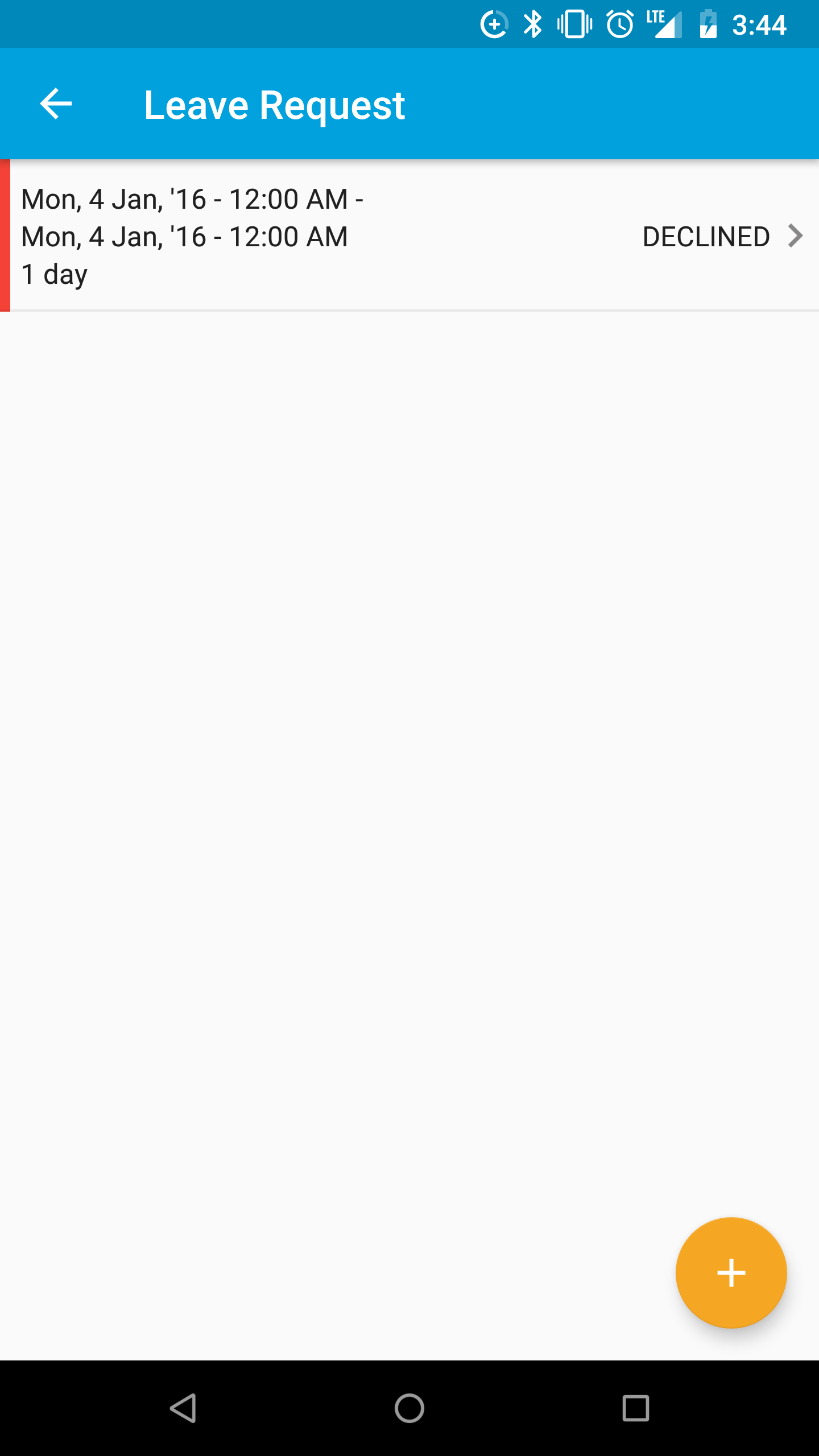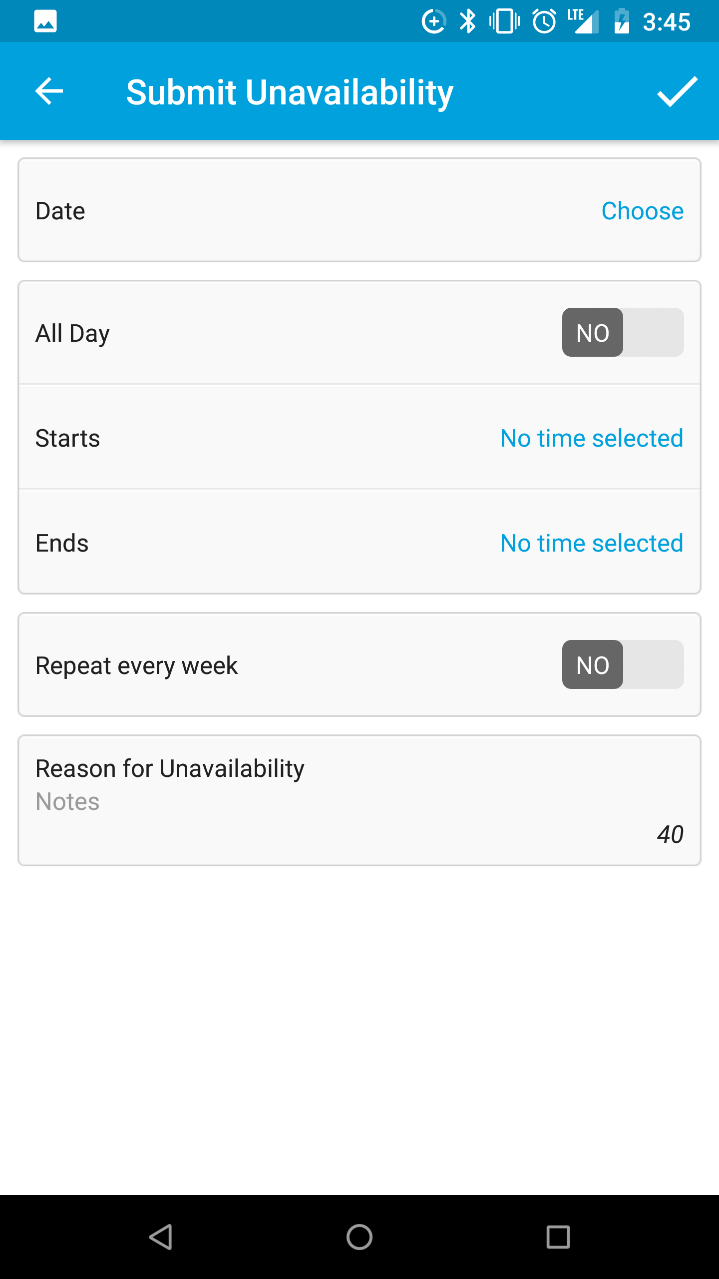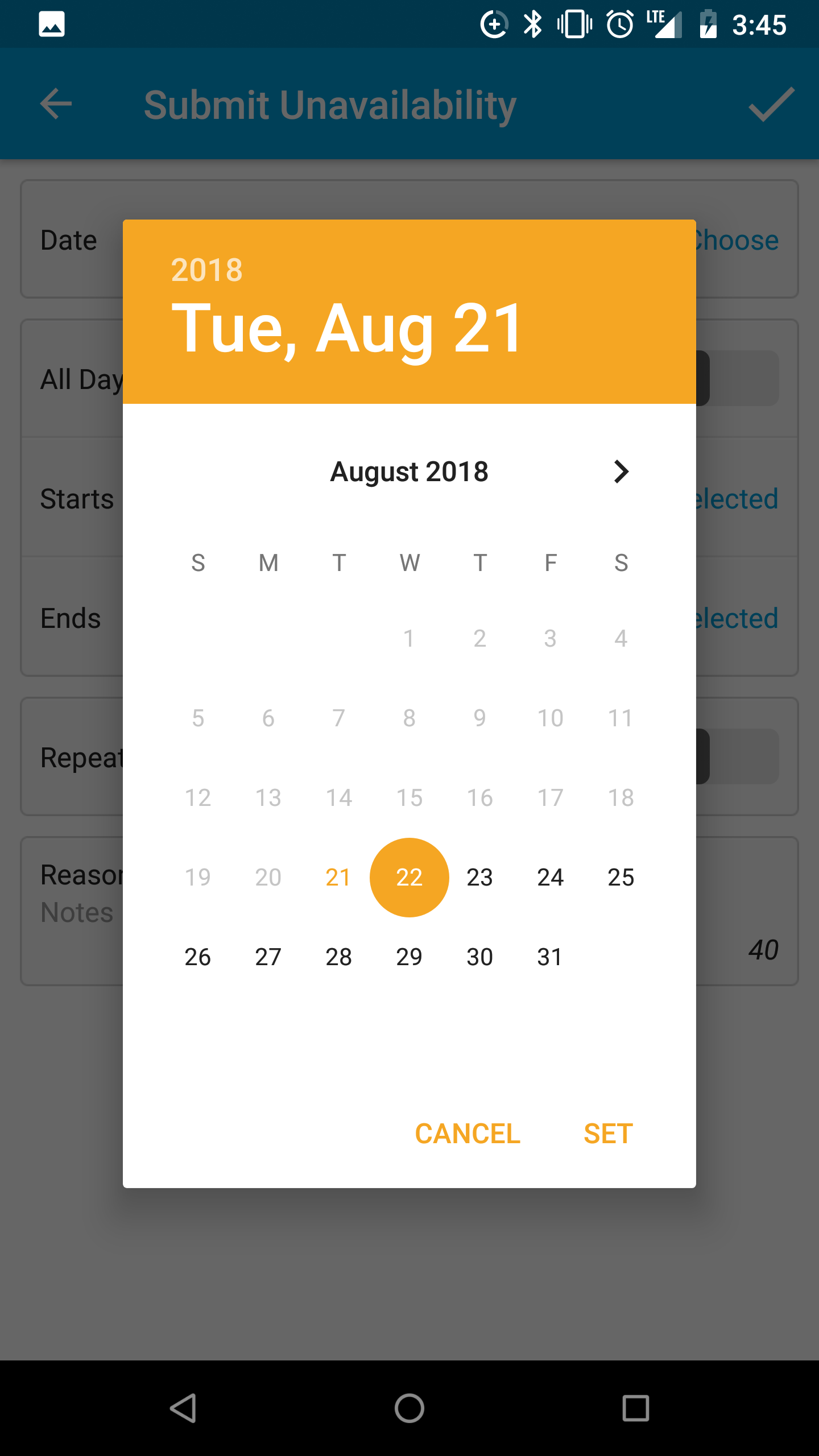
Small business owners and operations managers often spend too much time and effort scheduling, tracking employee requests, and processing payroll. In order to save time and money, owners and managers need a better way of managing their staff.
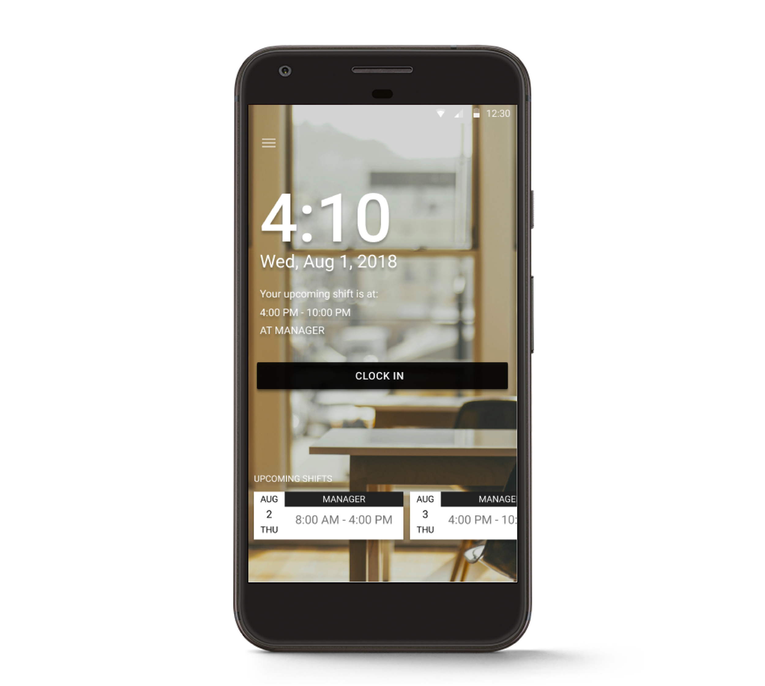
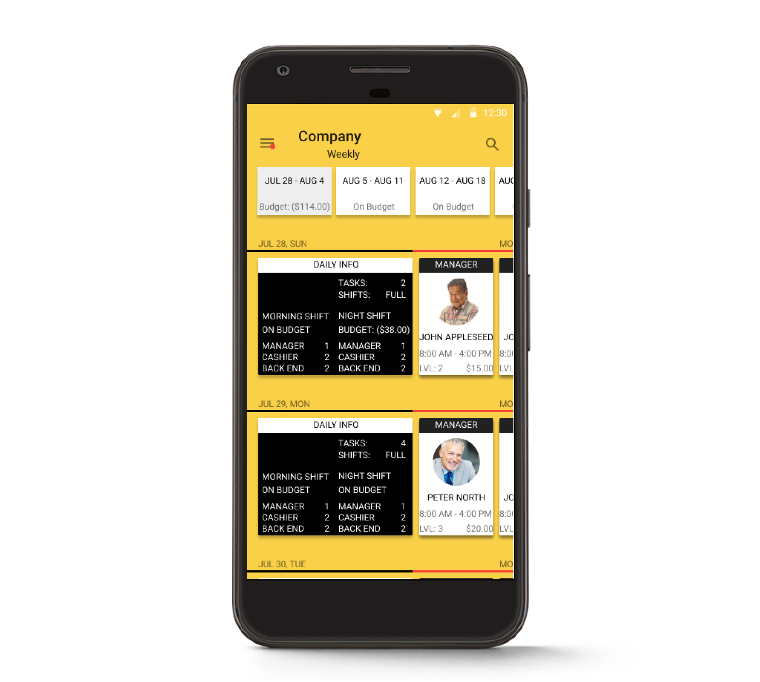
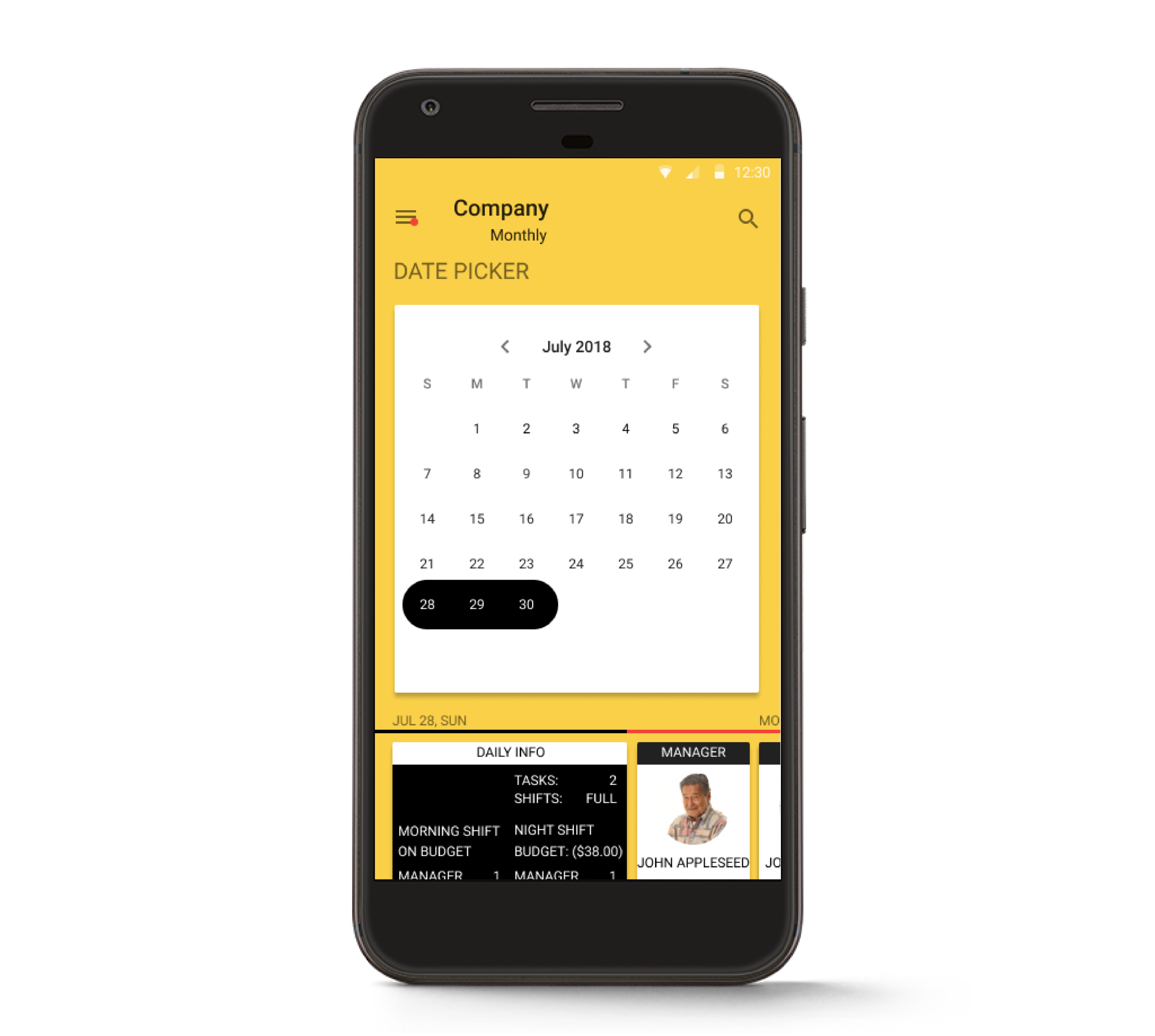
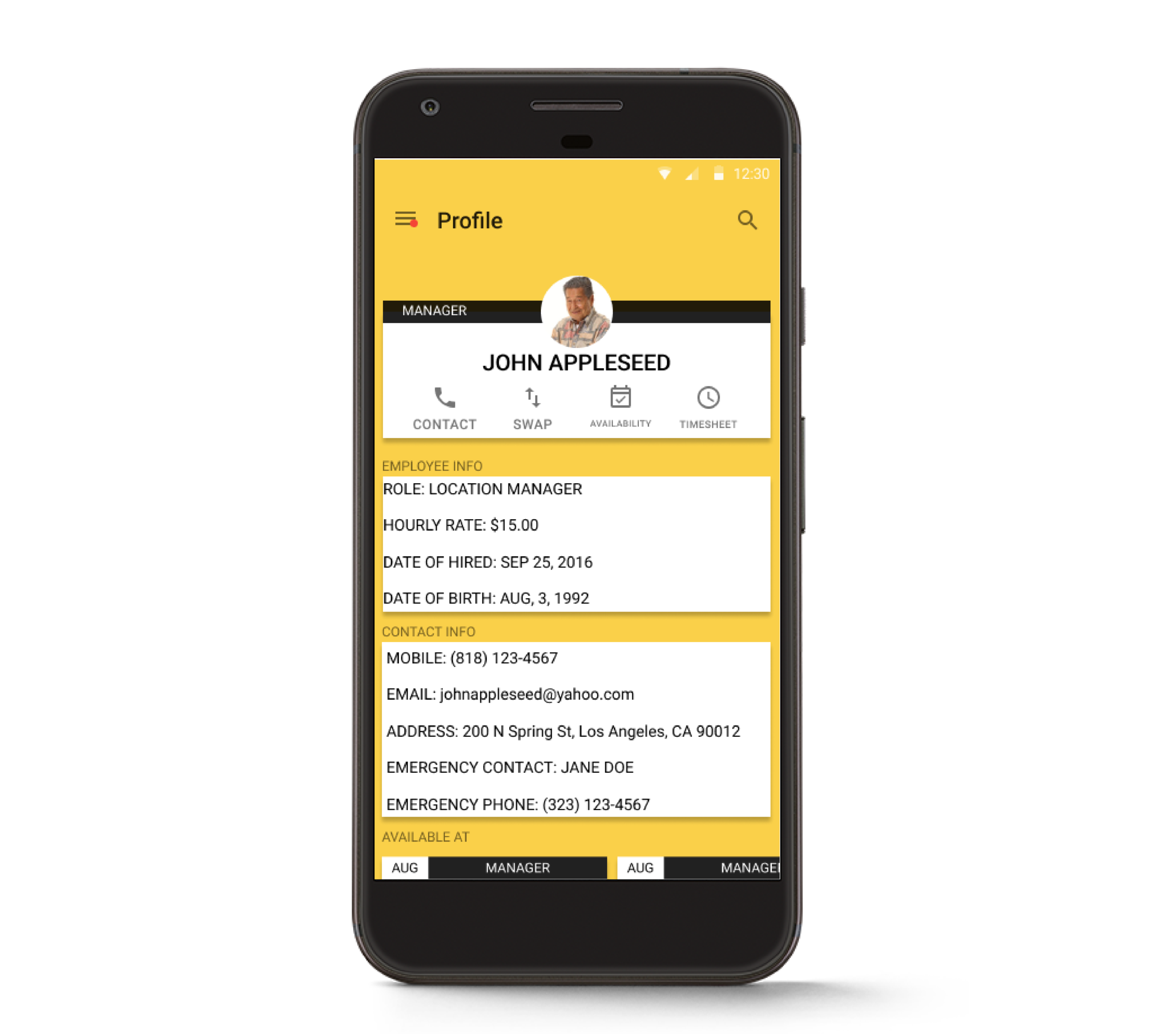
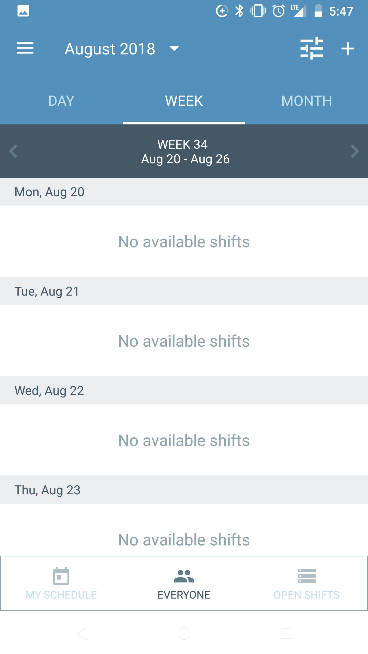
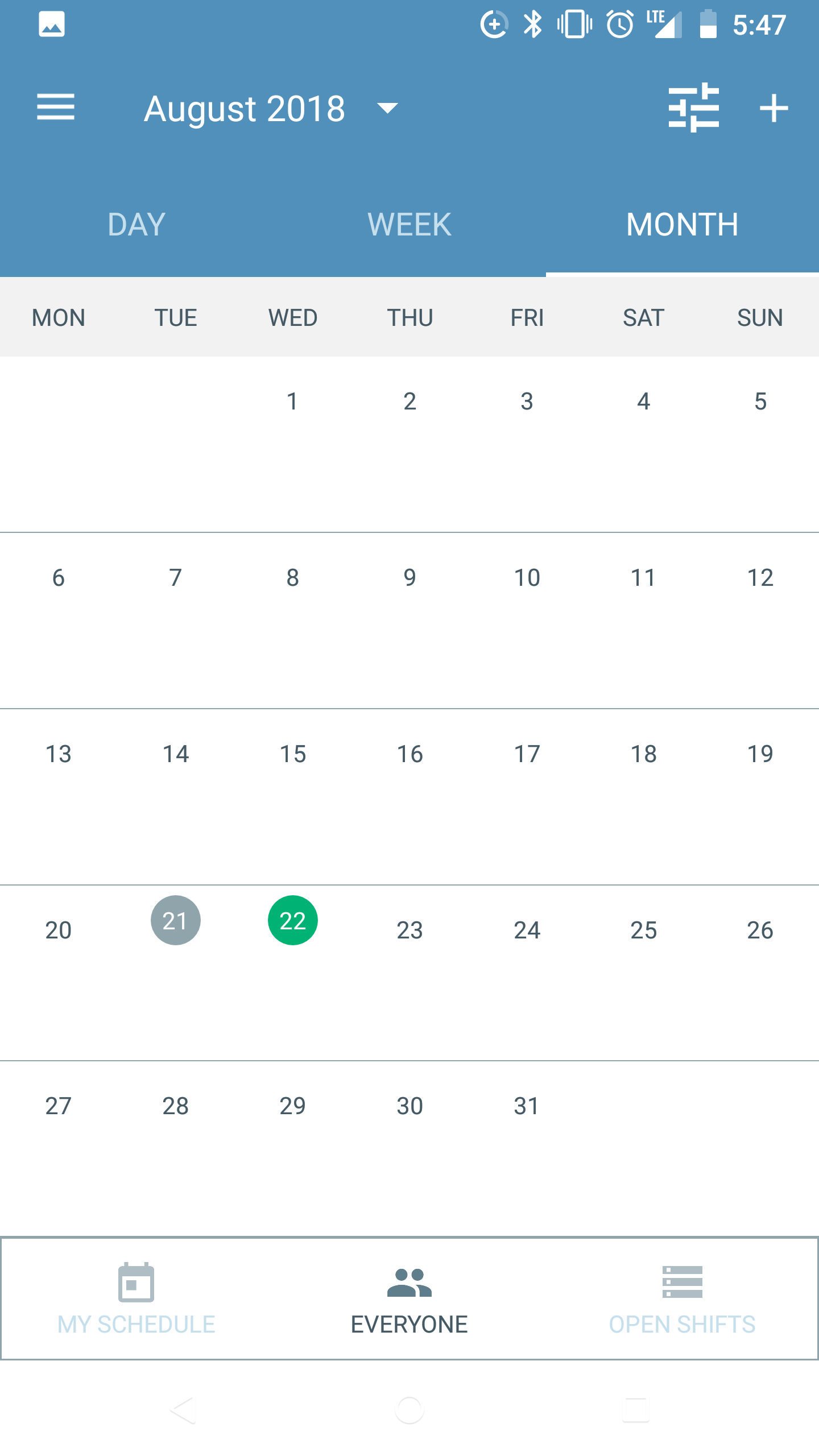
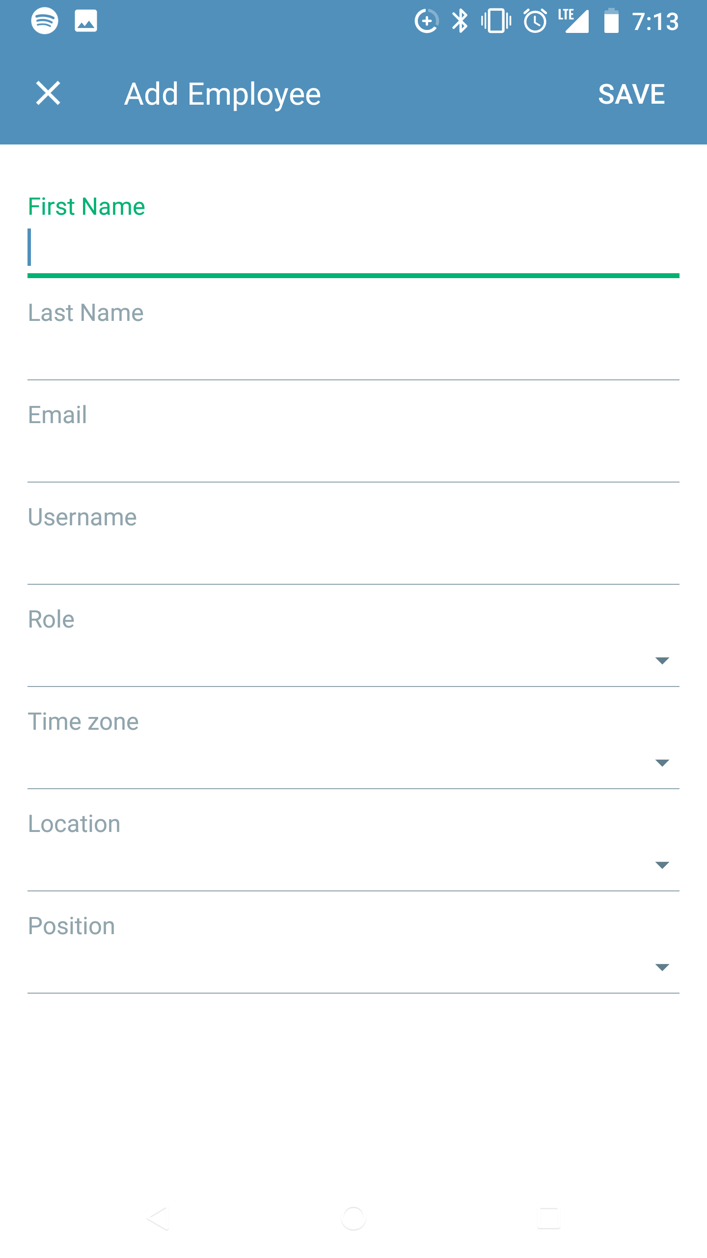
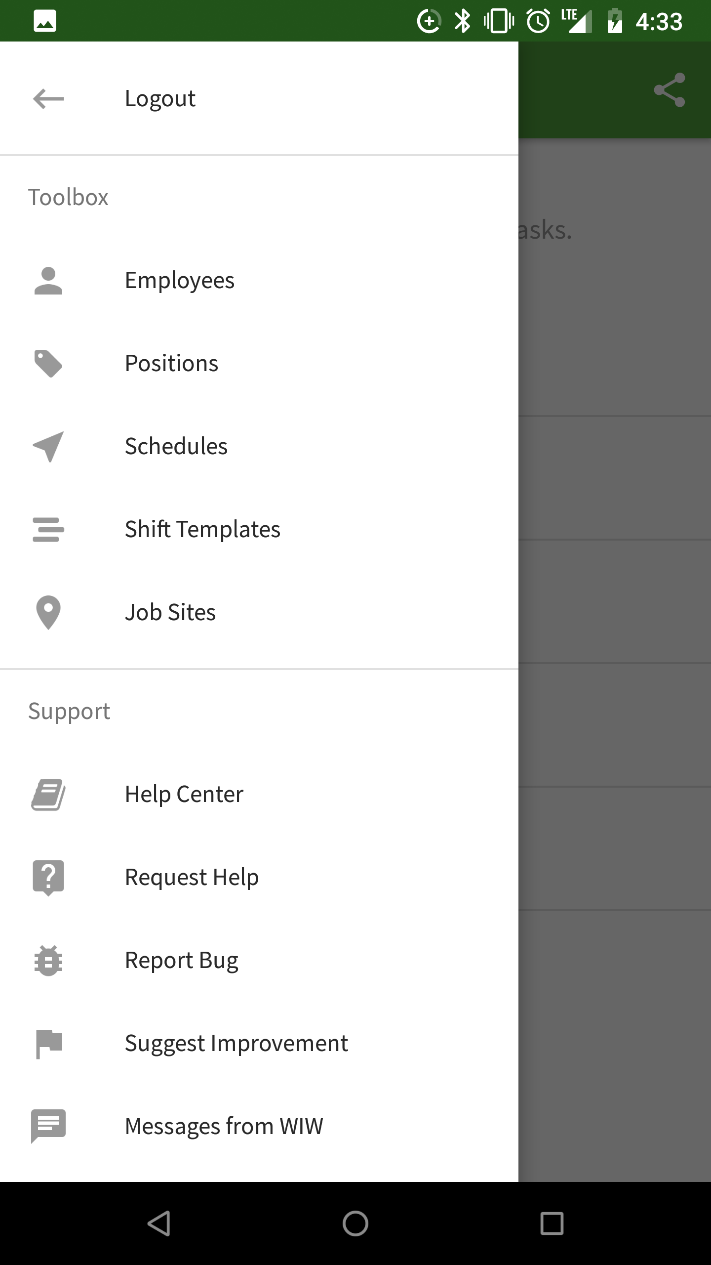
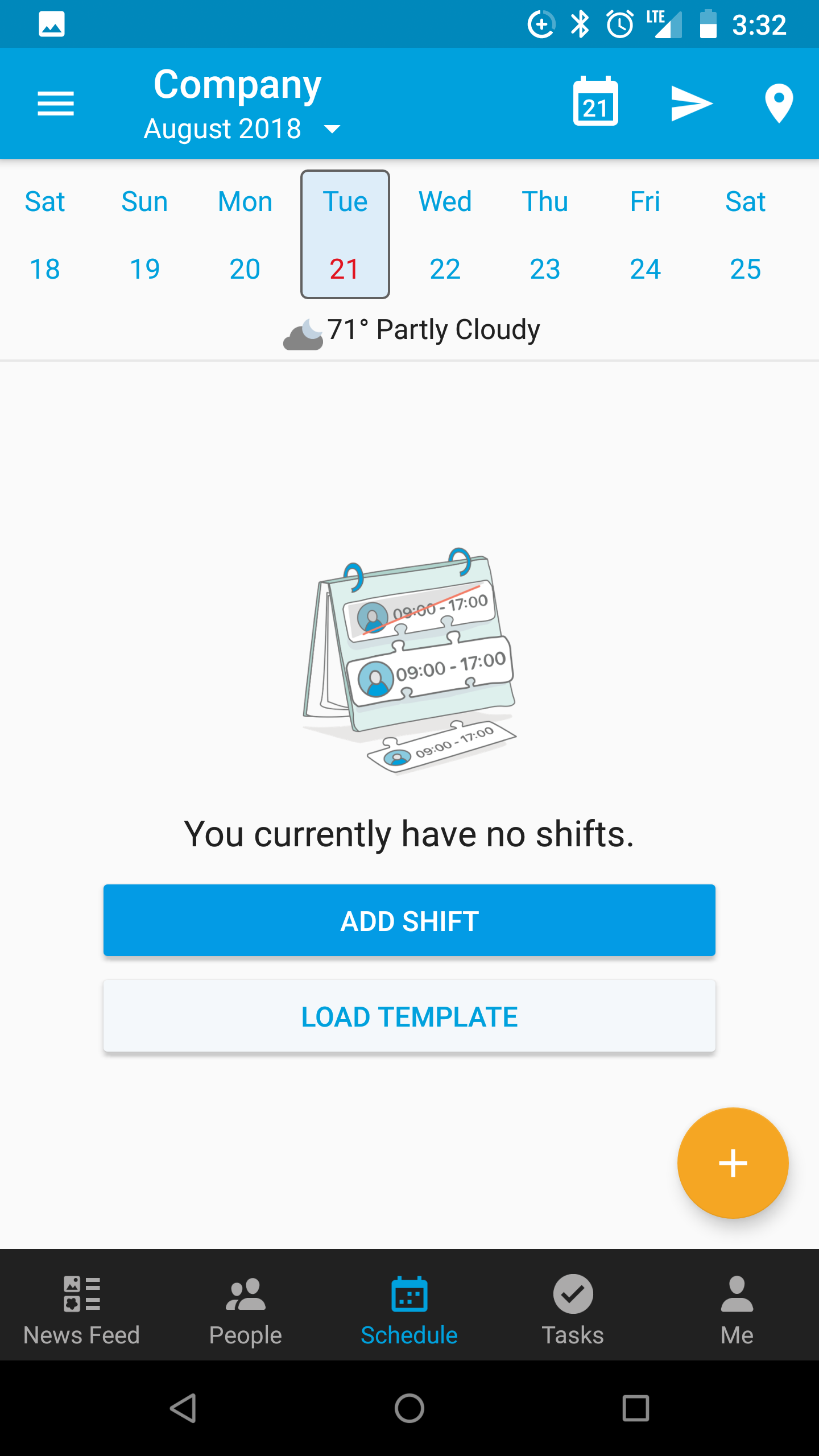
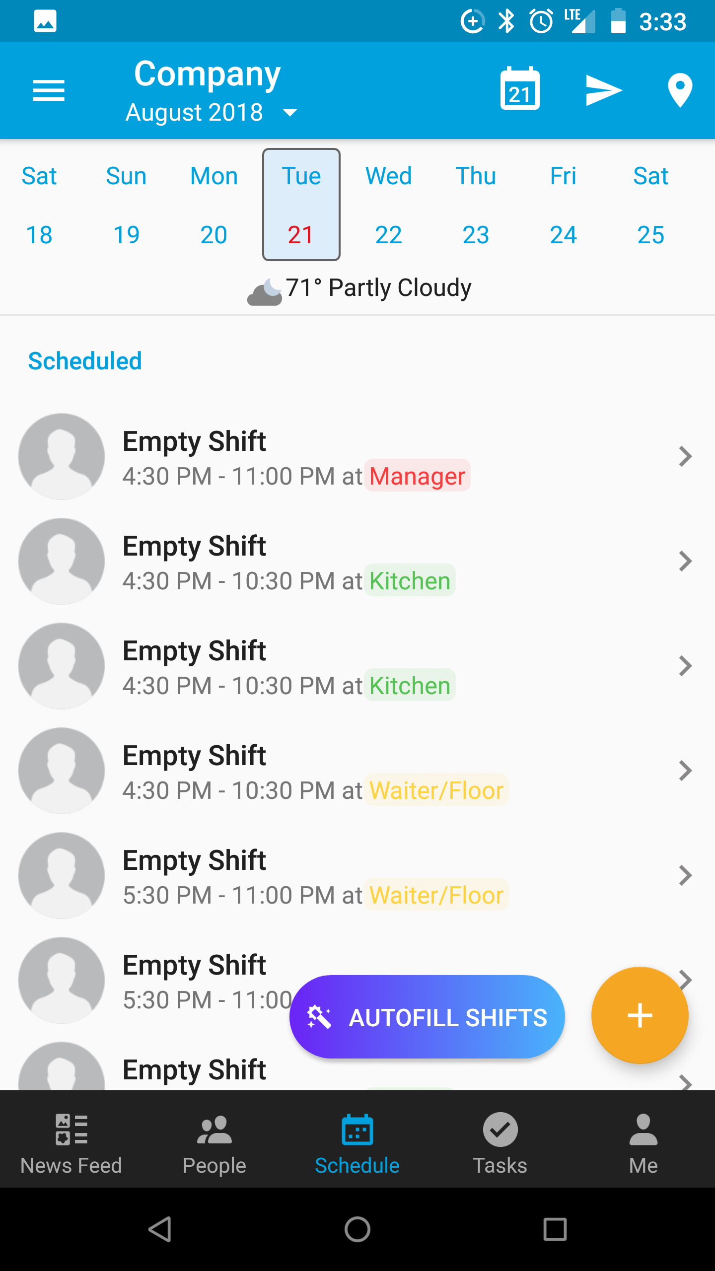
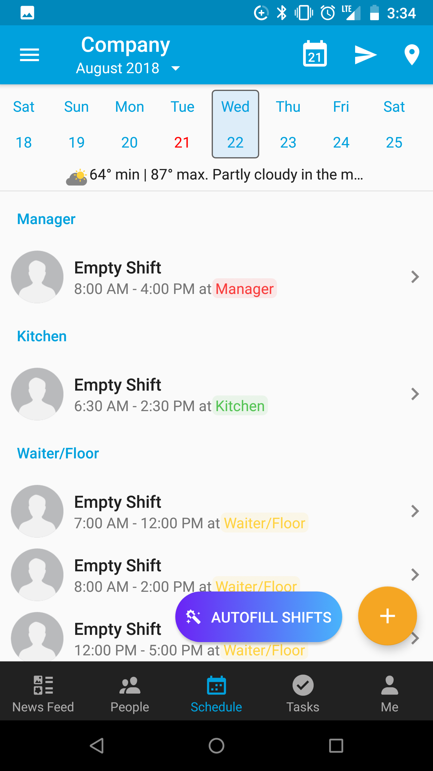
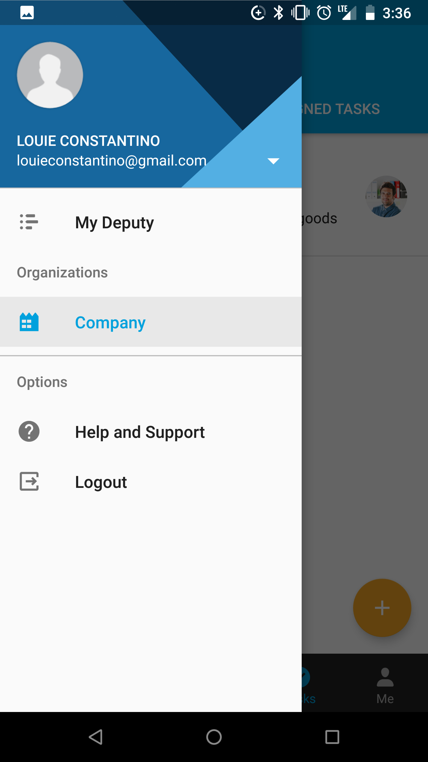
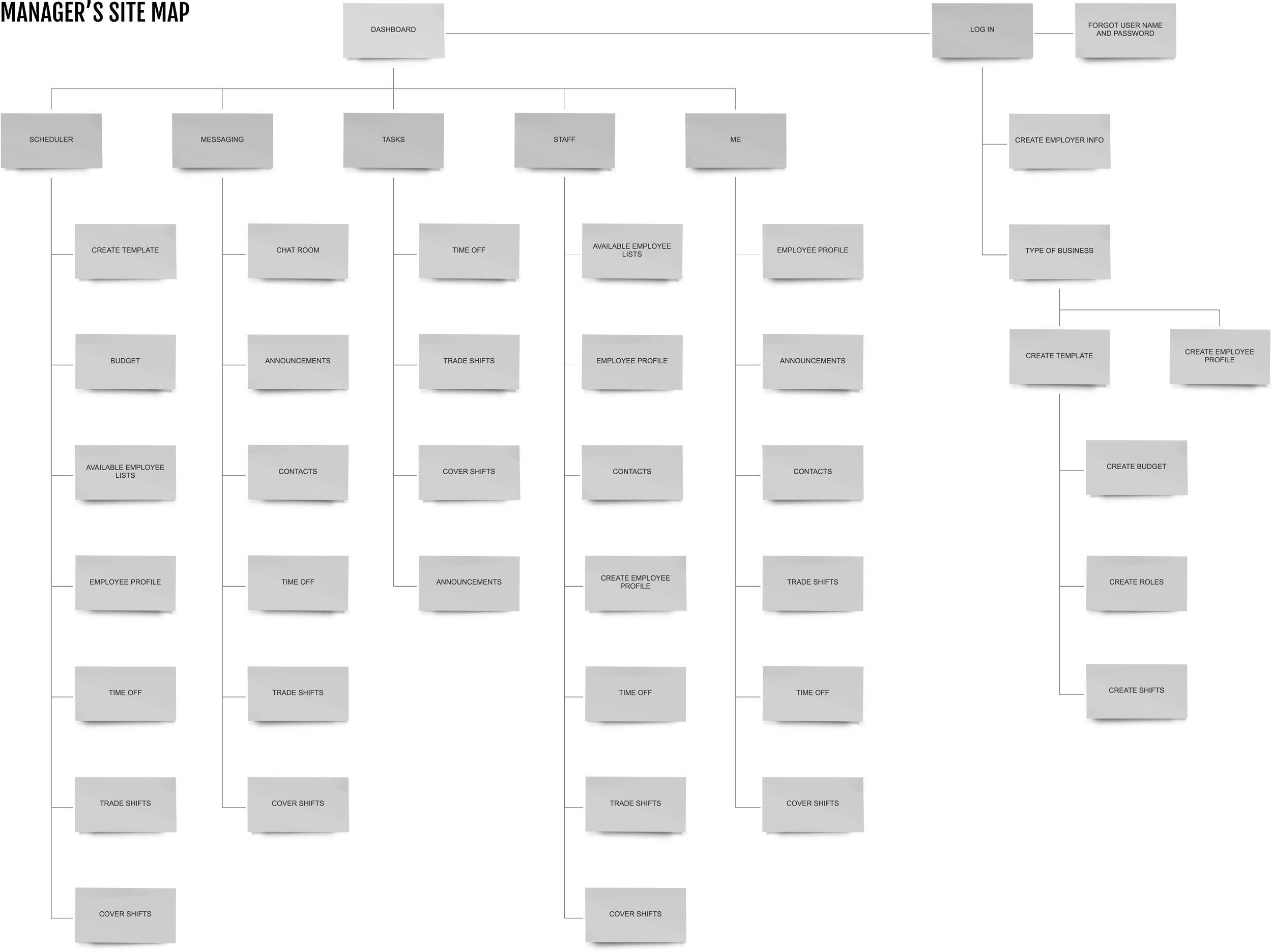
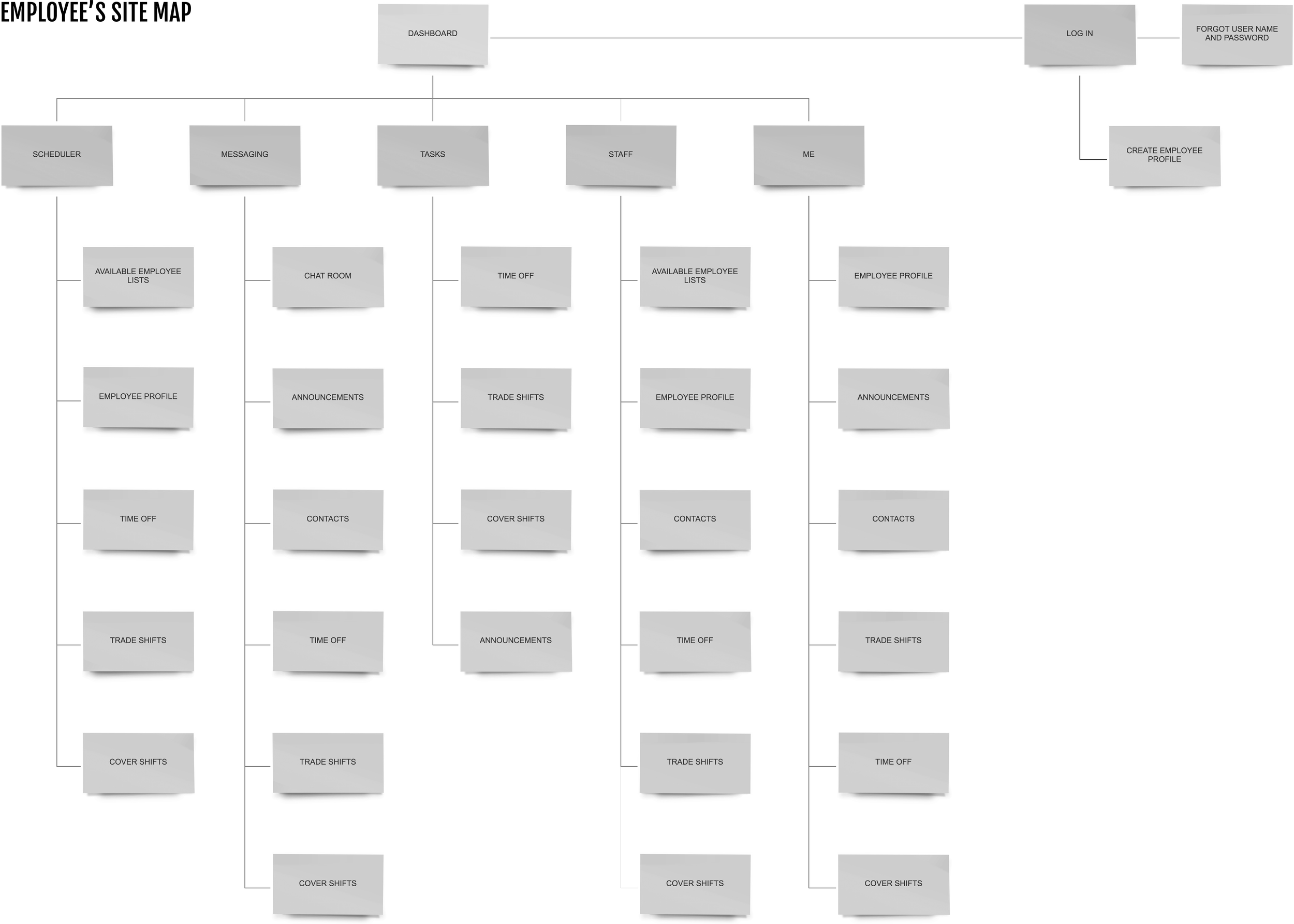
Sundial is an easy-to-use scheduling tool for small business owners, operation managers, and employees.
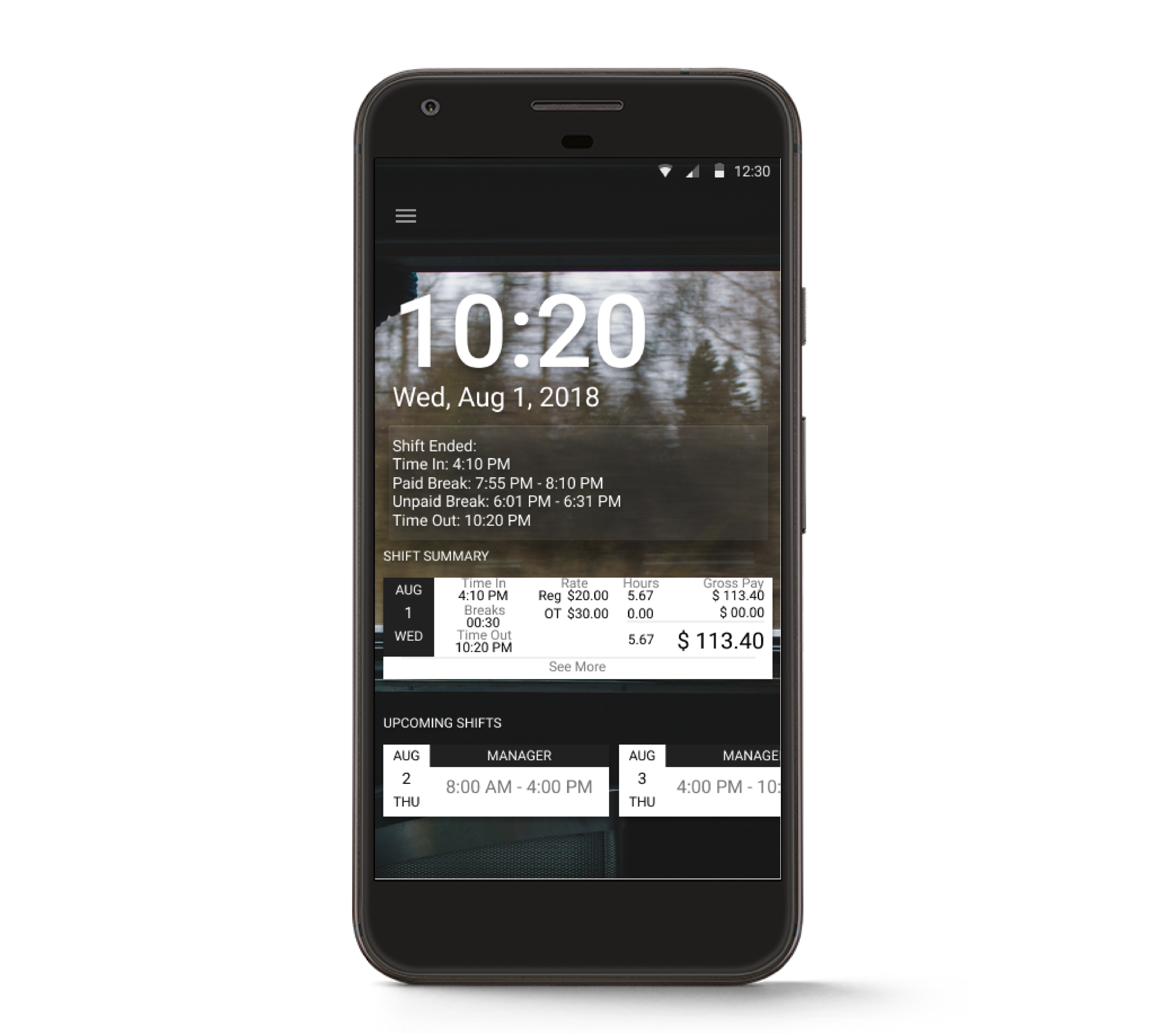
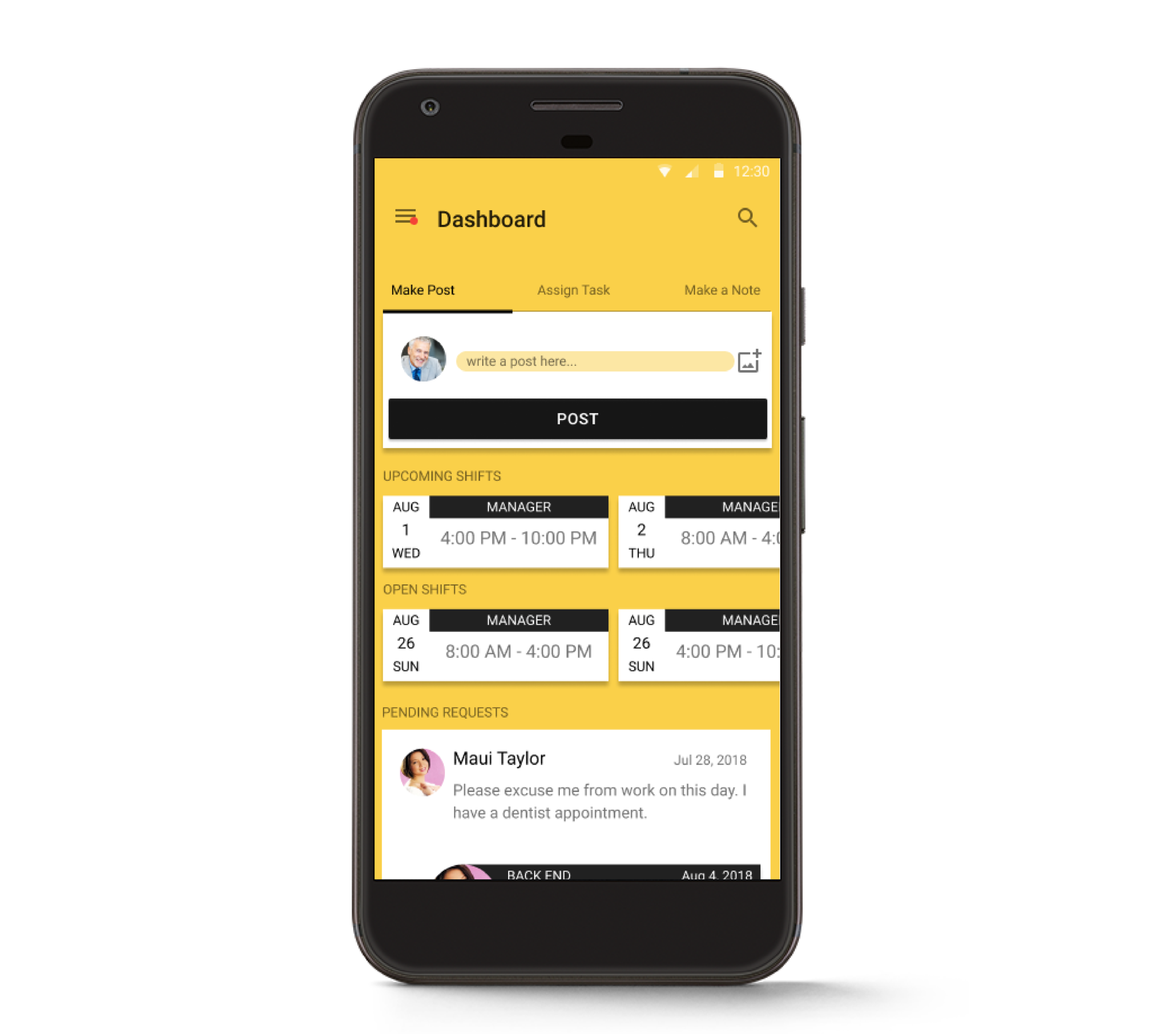
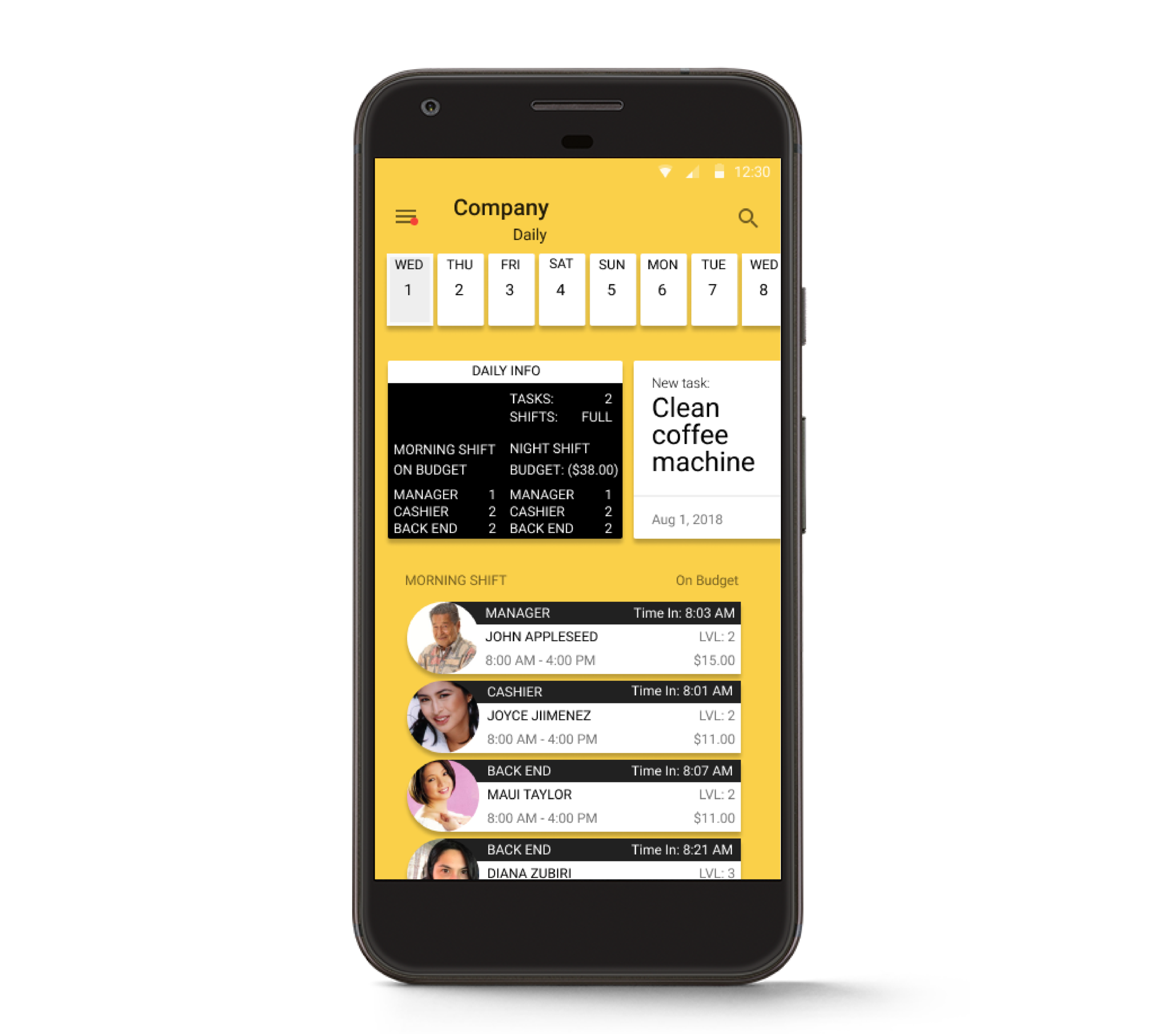
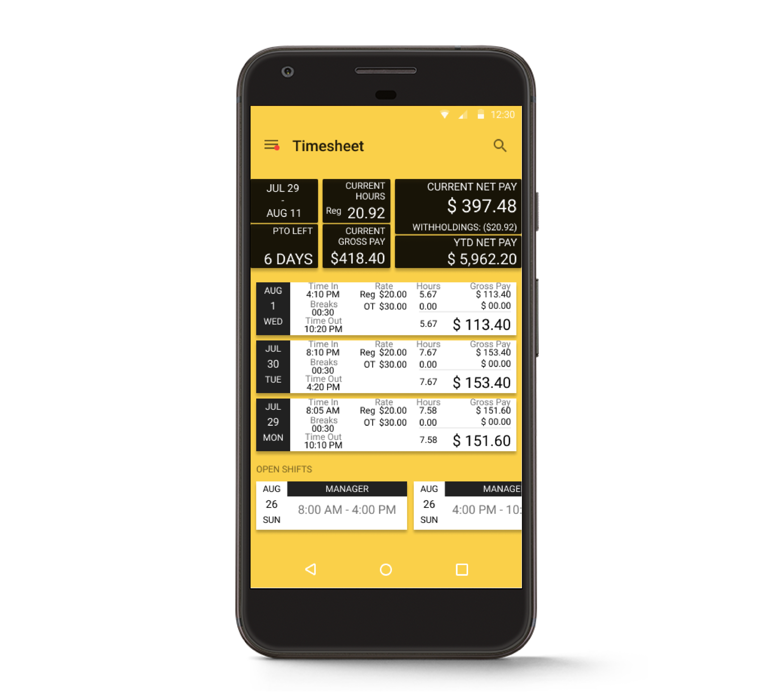
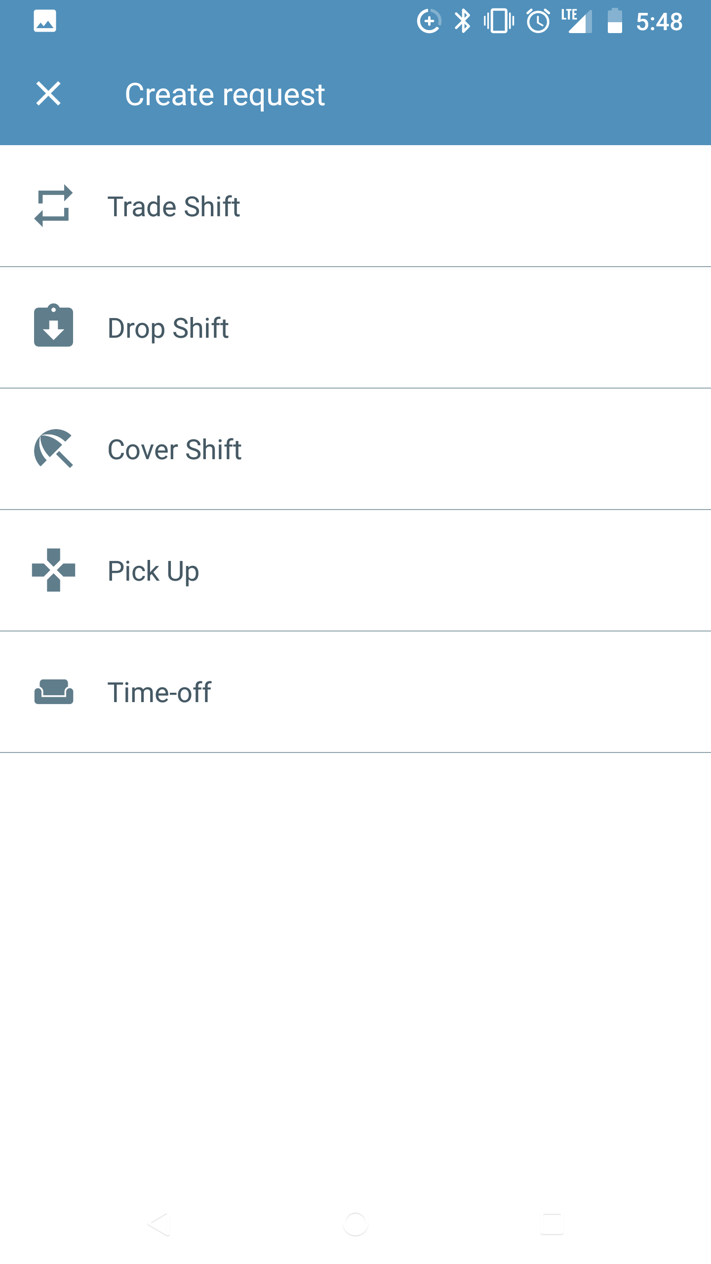
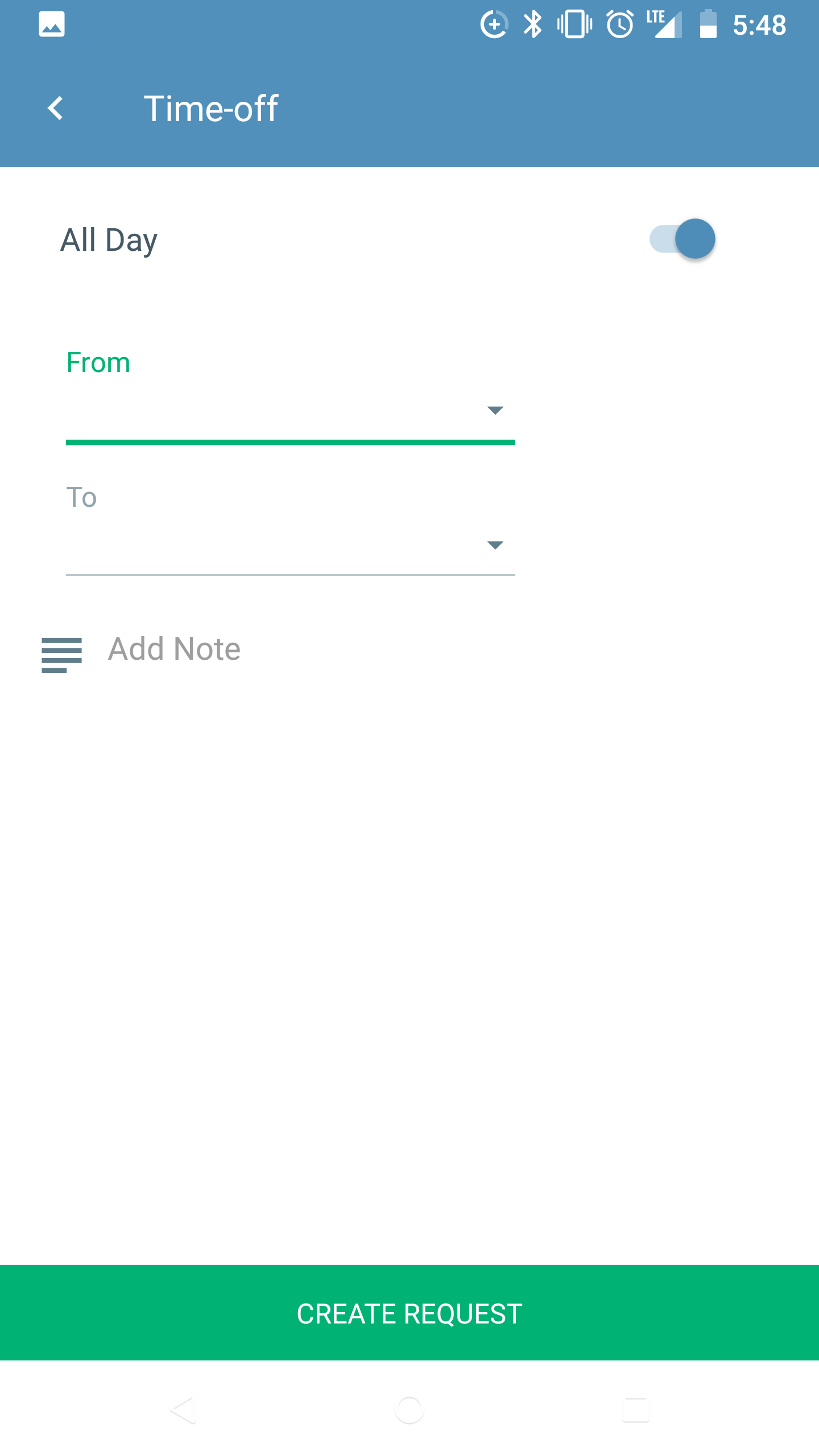
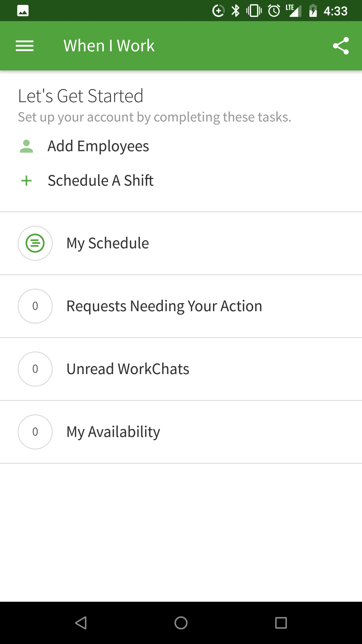
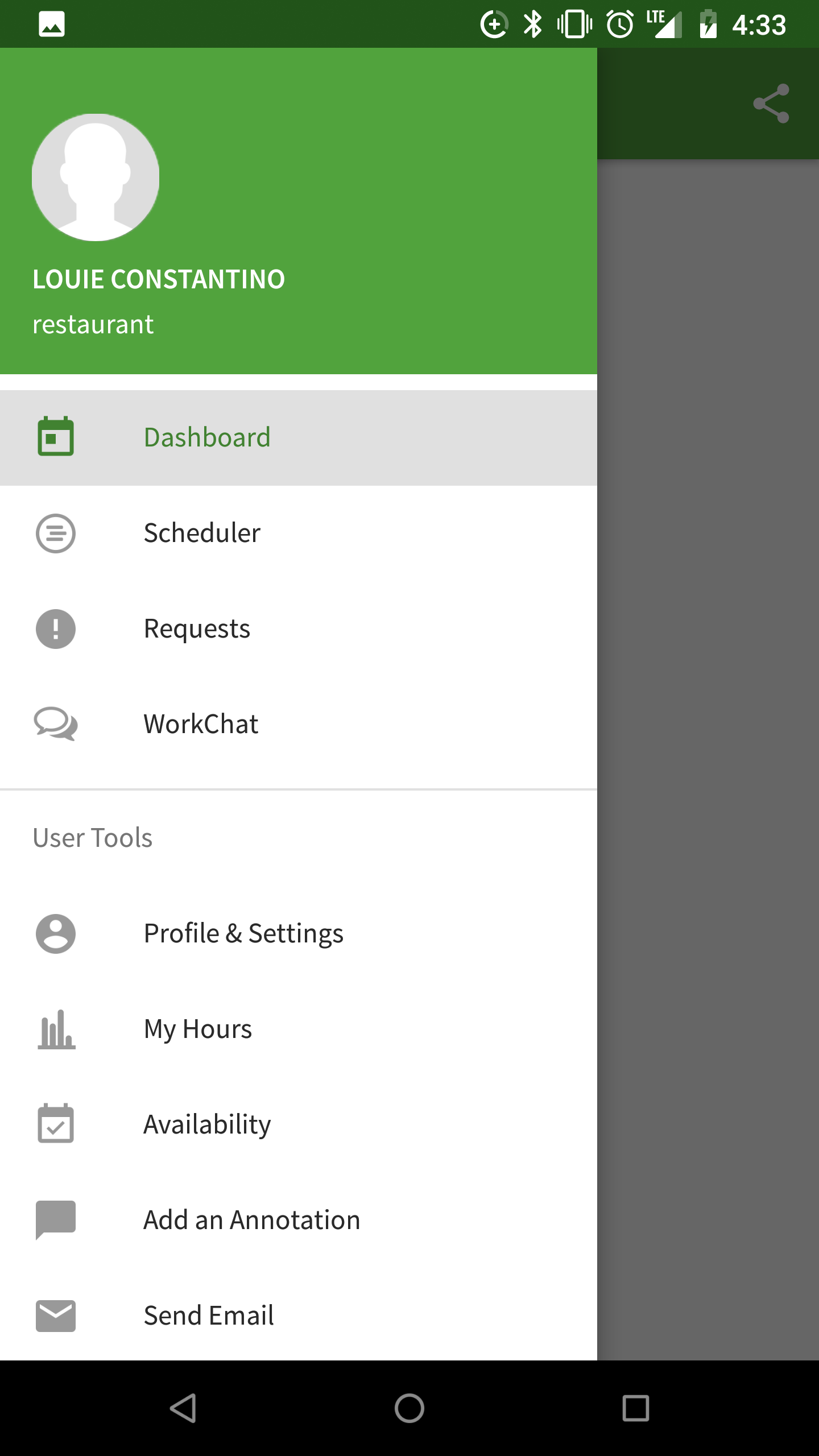
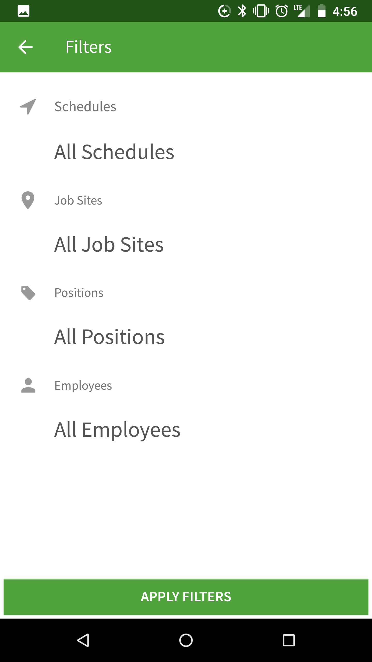
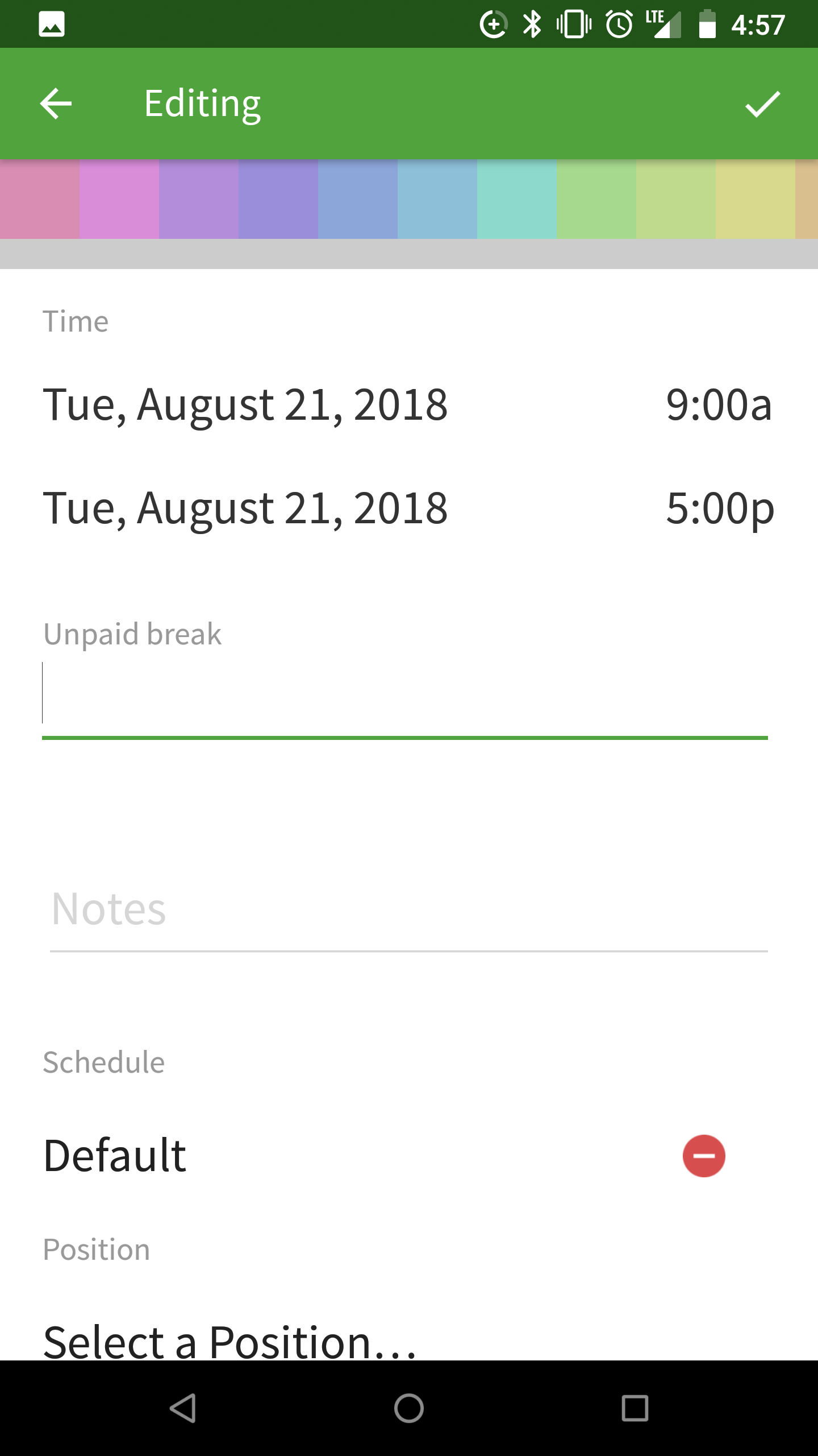
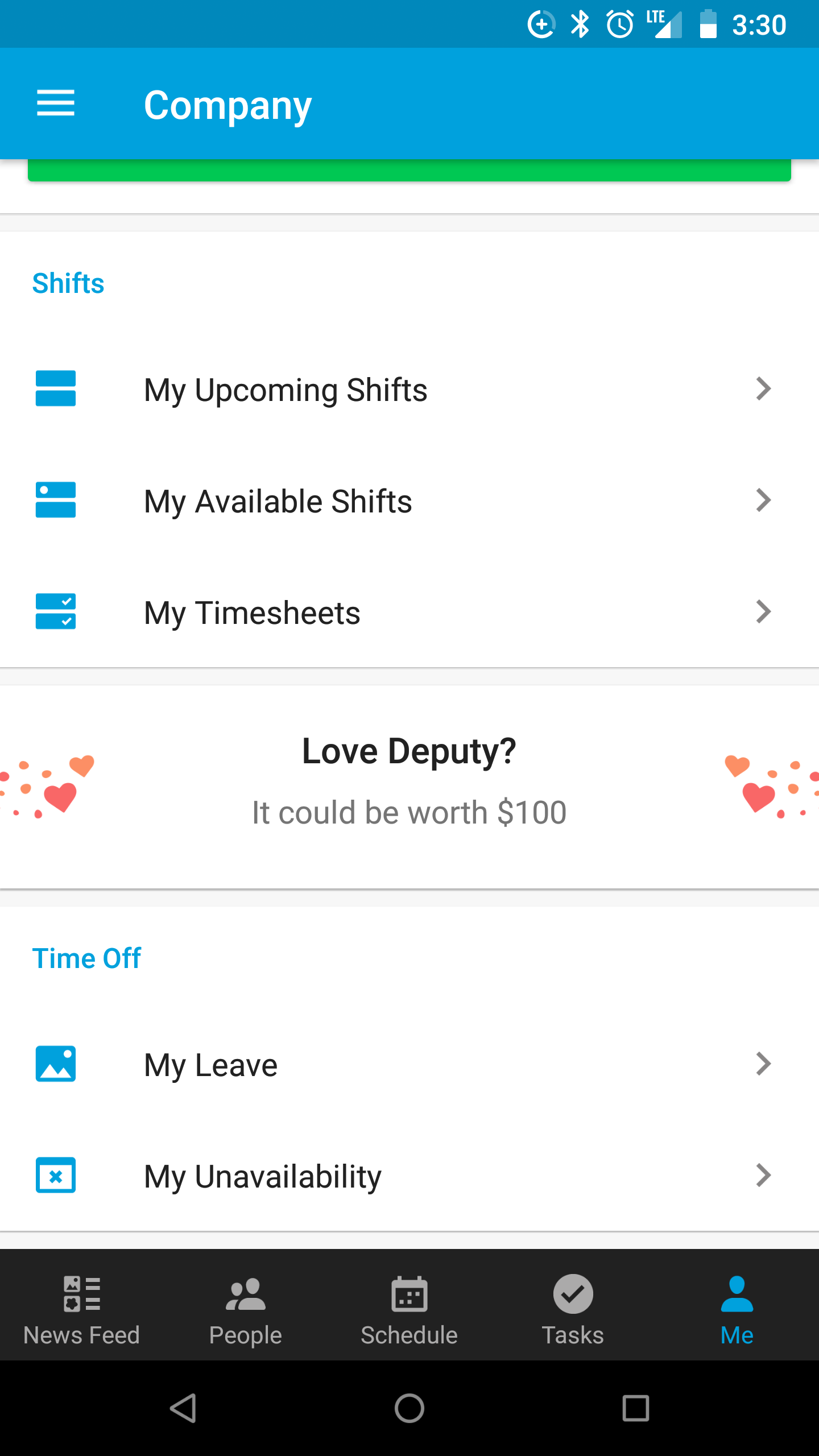
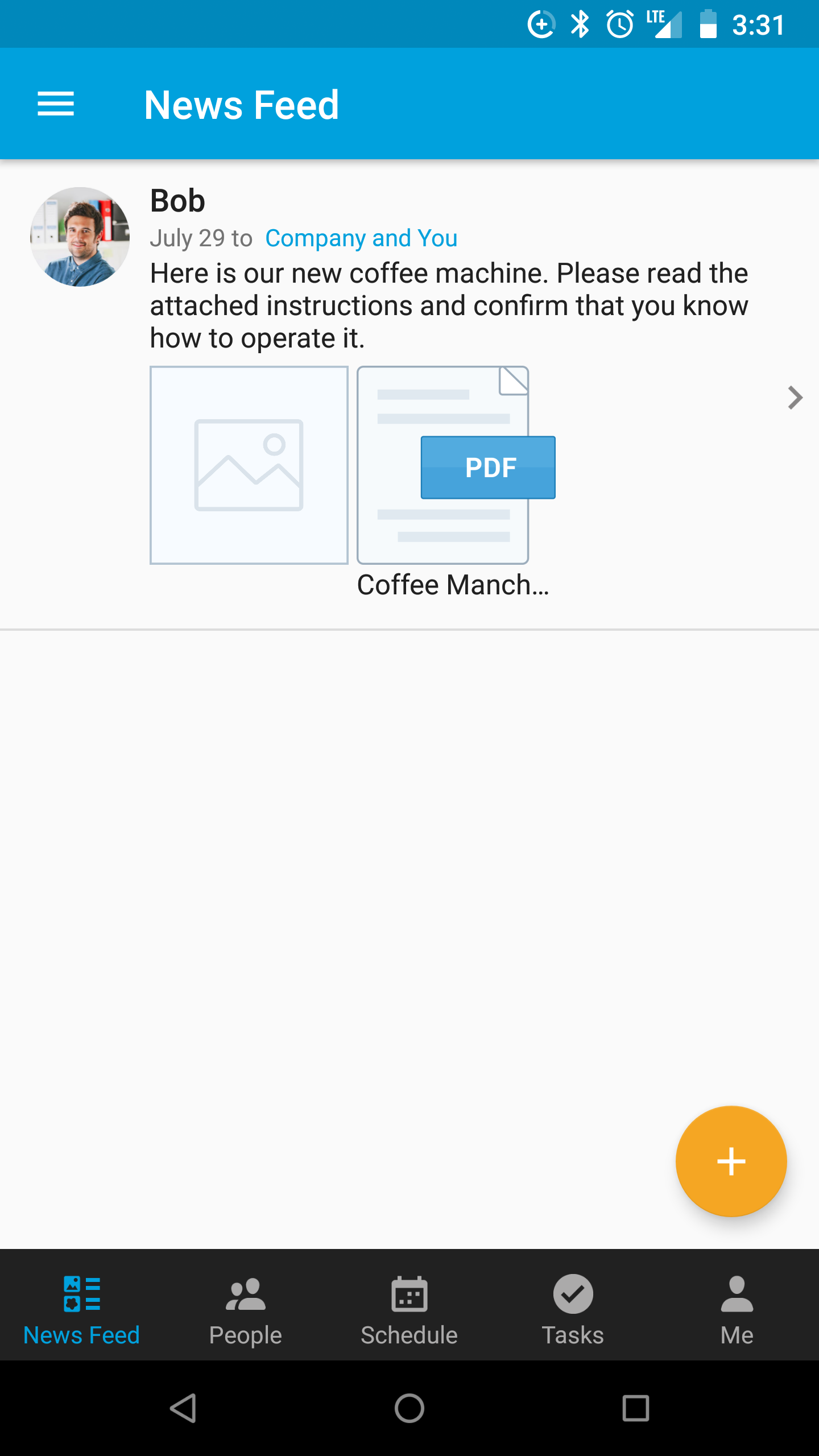
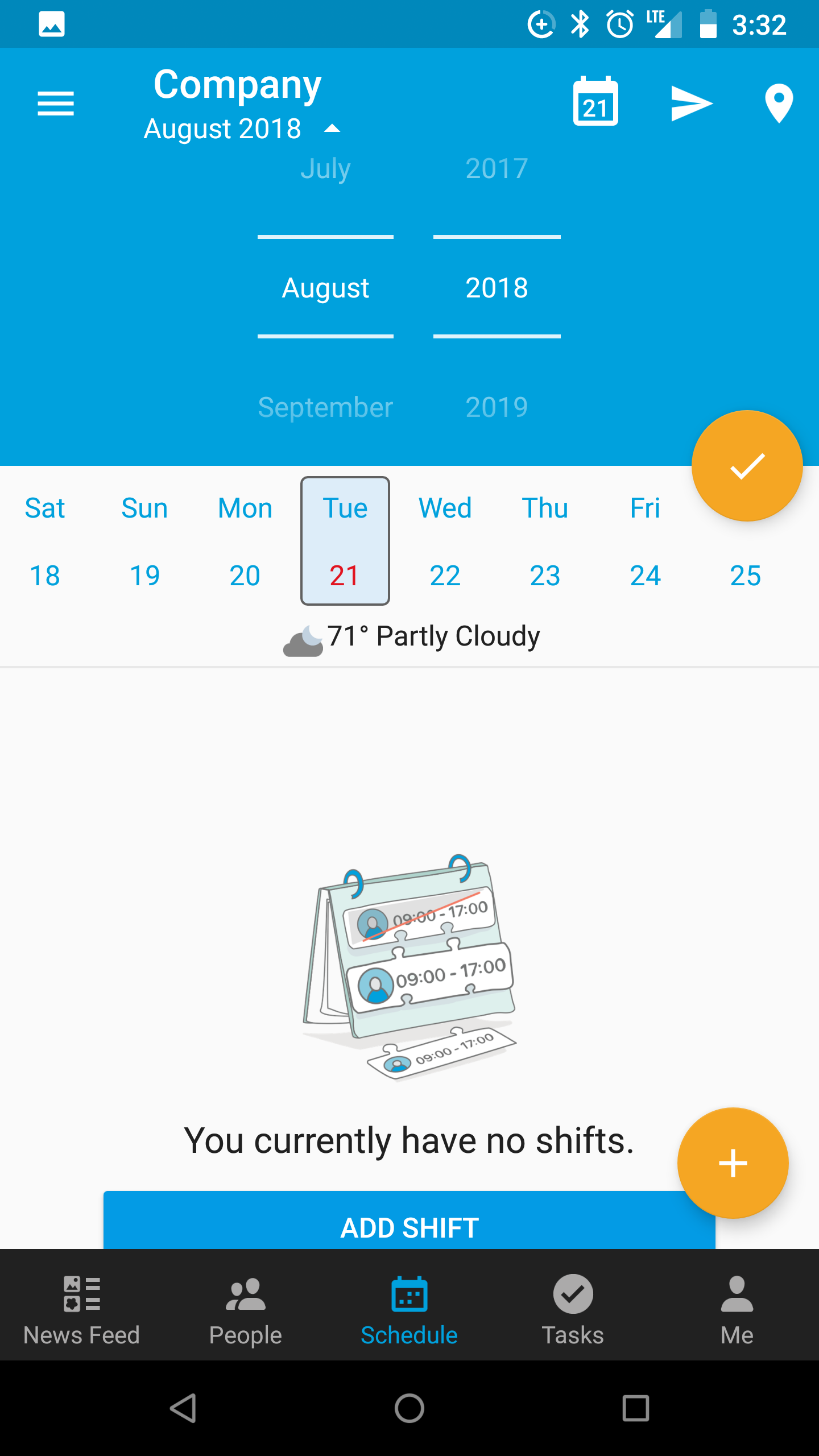
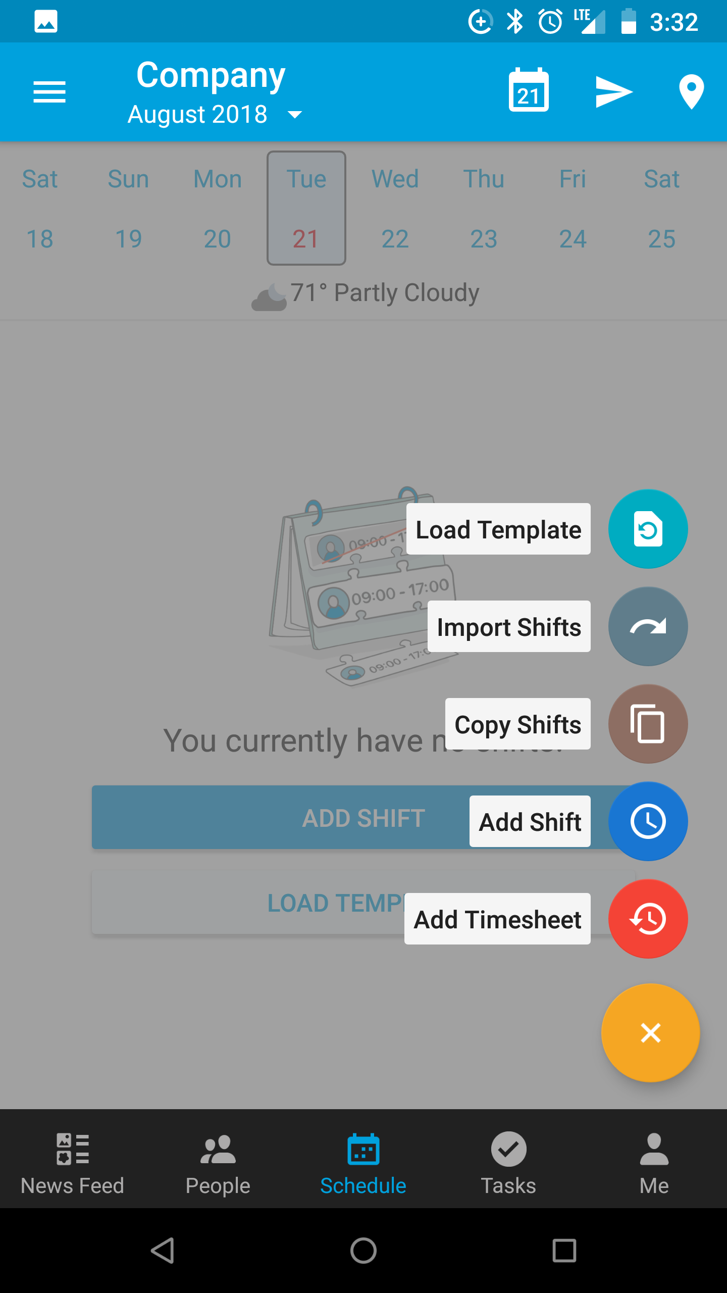
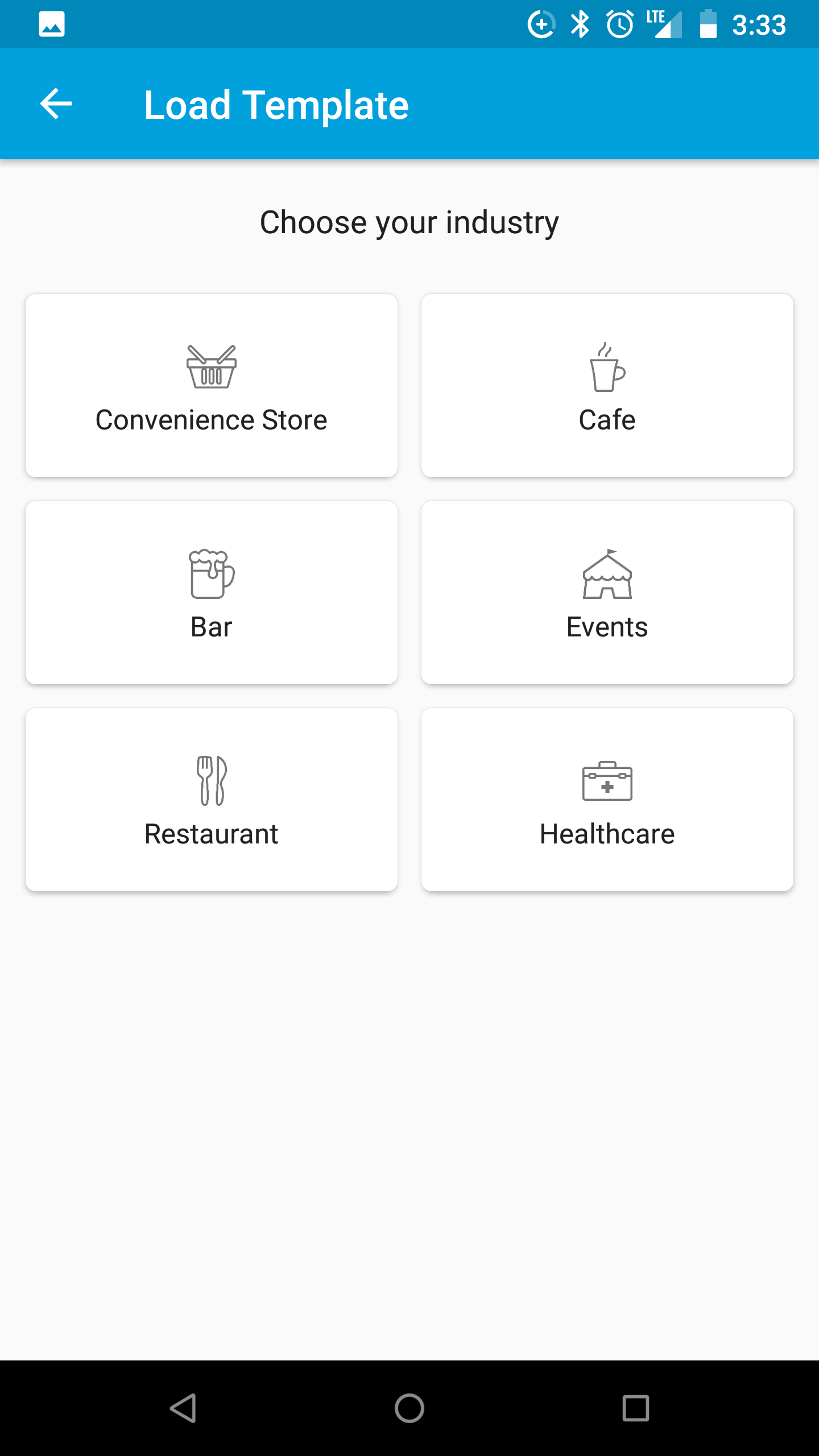
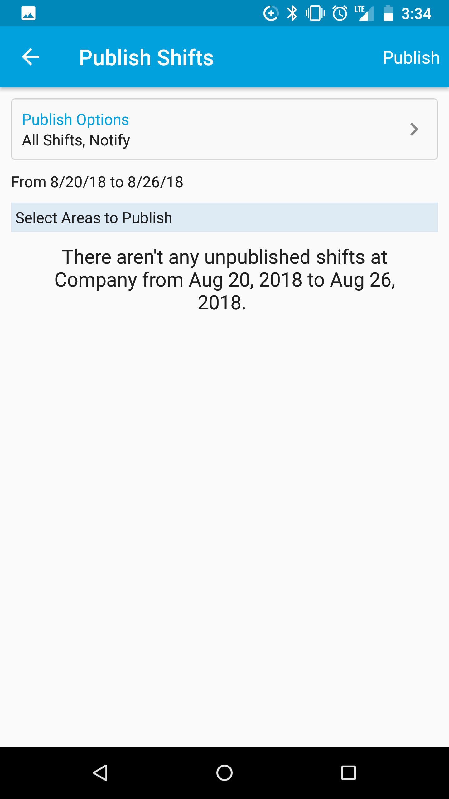
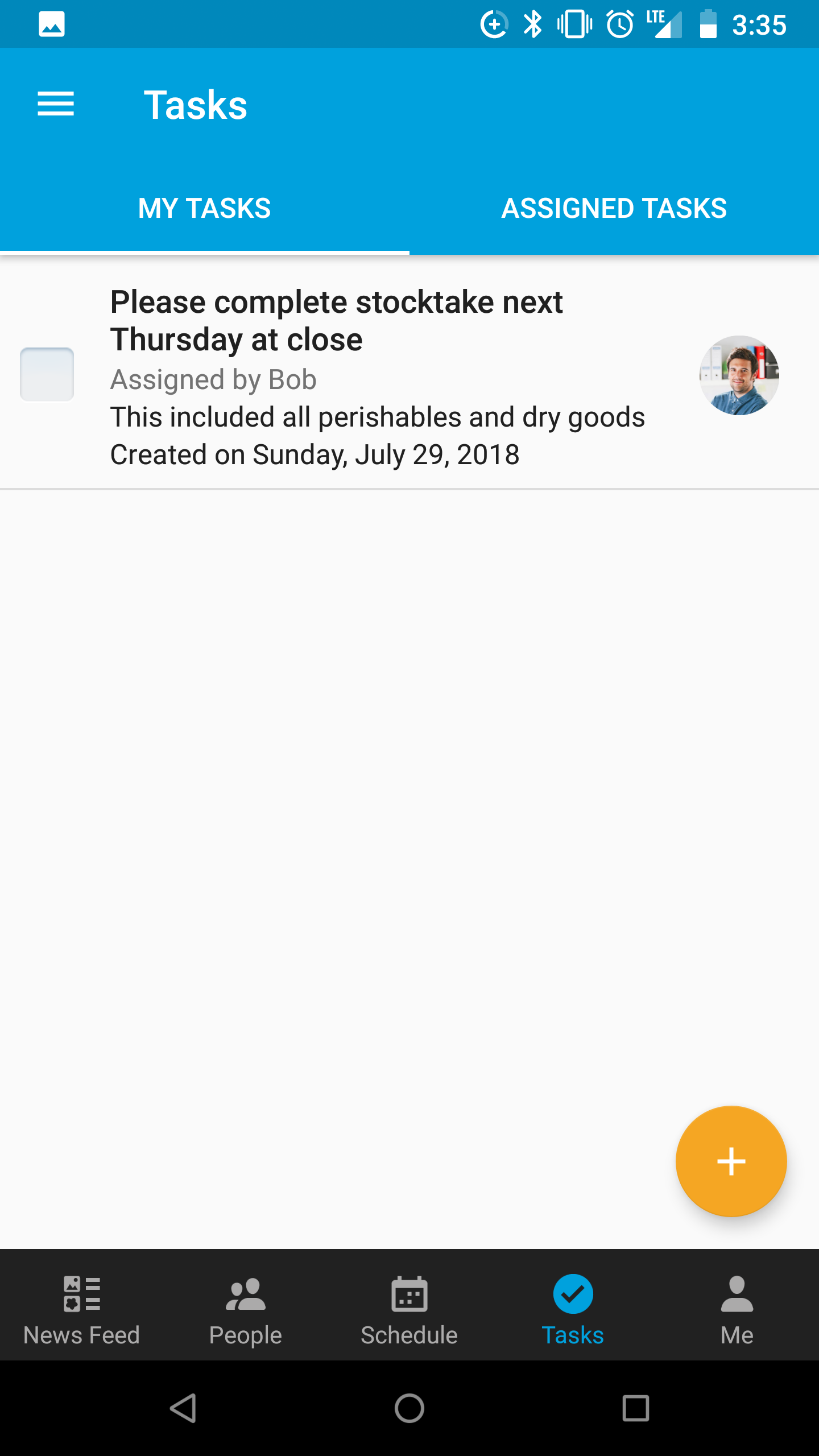
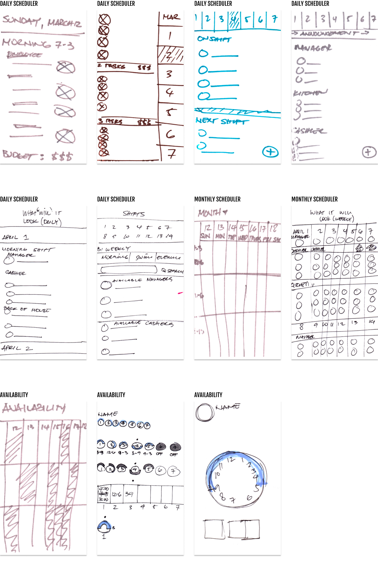
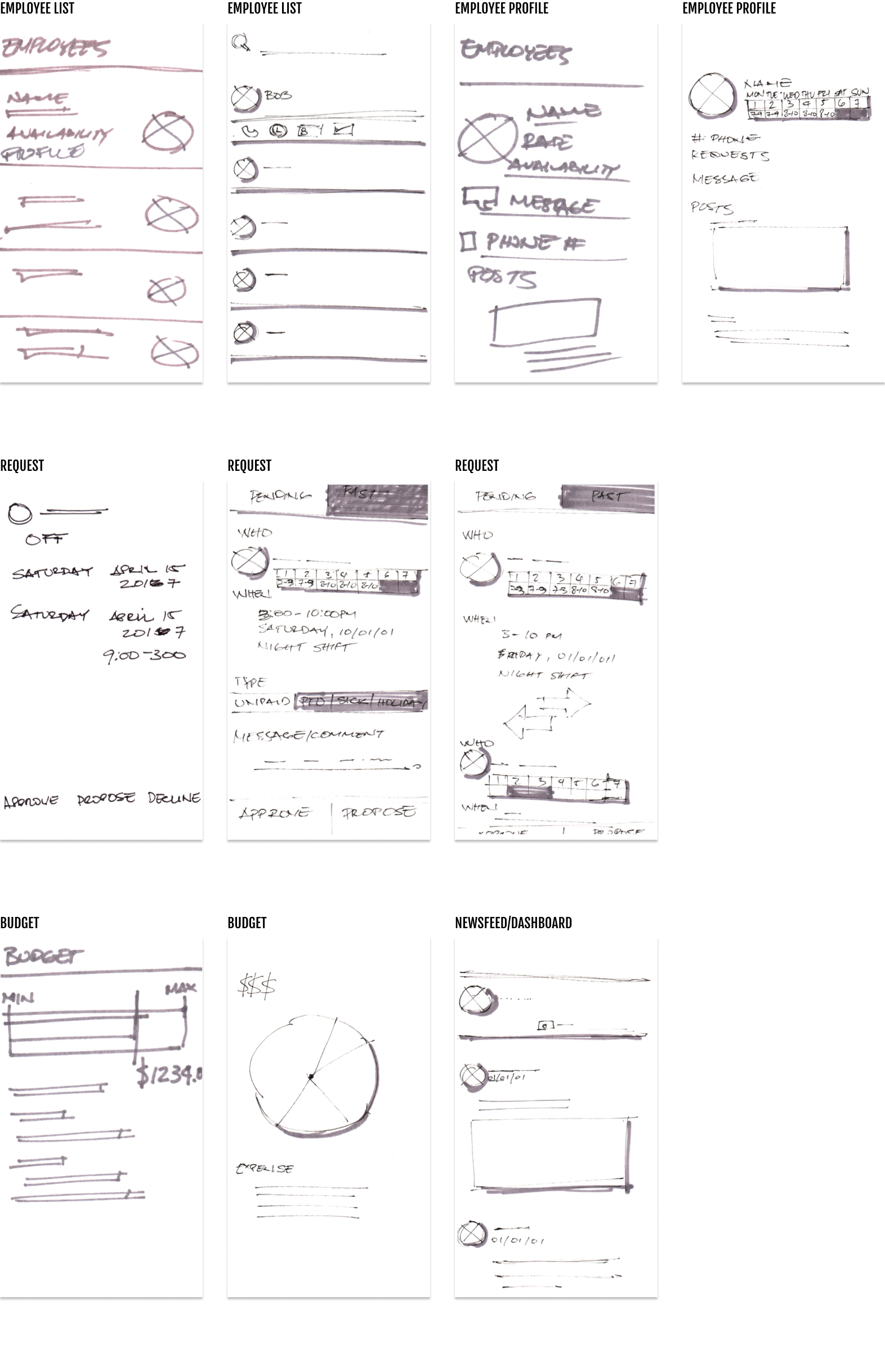
With Sundial, managers can create and edit schedules with a click, then notify employees instantly. Easily track employee hours for greater payroll accuracy and insight into workforce productivity. And communicate with the business to keep the team up to date, engaged, and connected—Anytime, anywhere.