CDL_FinalLogo_White.png


Café de Leche is a local coffee shop in Highland Park, Los Angeles, CA. With the coffee business booming, stakeholders are looking to scale via e-commerce.

By redesigning the current website, Café de Leche will serve small batch, handcrafted, roasted coffee from their own local community and worldwide.

CDL_BG2.png
 

OVERVIEW

With the coffee business booming, Café de Leche owners are looking to scale via e-commerce. Thereby, commissioning me to update the current website.

While Café de Leche already has a website, it is not catered for e-commerce. I collaborated with the stakeholders to strategize design approach for the site. Further user research was also conducted, yielding ideas that caters the user’s needs and the stakeholder’s objectives.


ROLE:

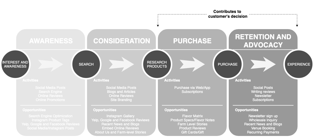
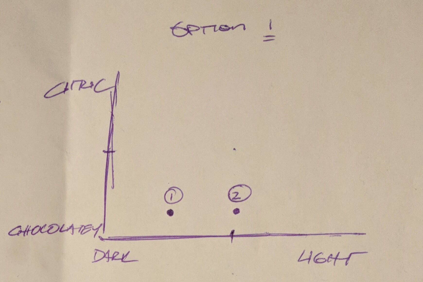
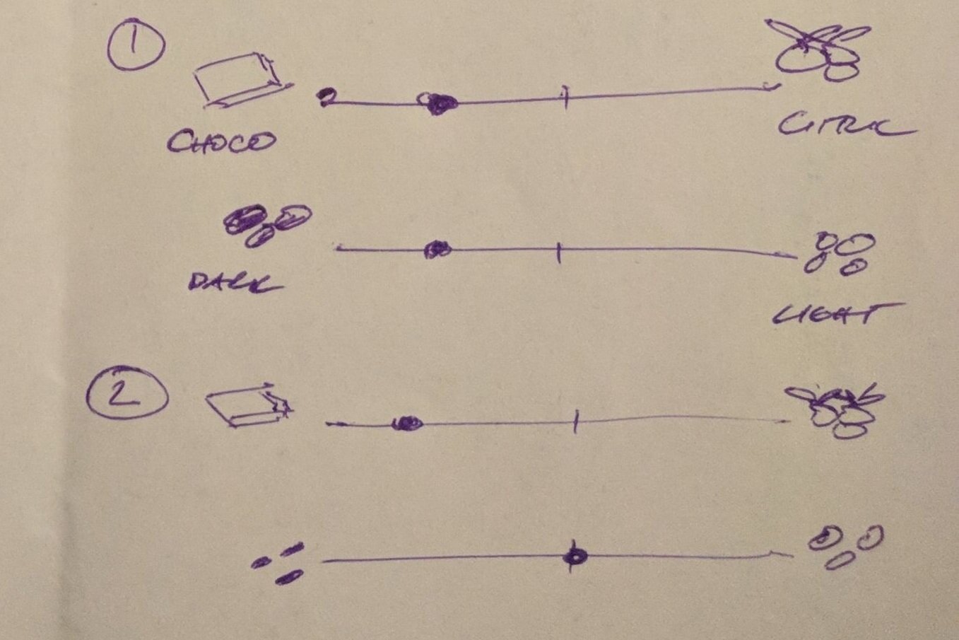
As a UX designer, I introduced UX design thinking to stakeholders. Conducted research on the current website and assess what needed to be removed and updated. Facilitated a brainstorming session with the client to define business objectives, collect information, collaborate and strategize the design process. Using the collected information, we profiled the café’s customers and synthesized personas. I furthered the user research and created user flows to cater to the client’s objectives and the site’s primary users—the customers.

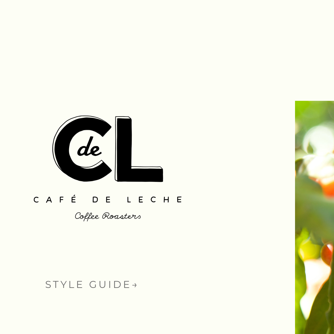
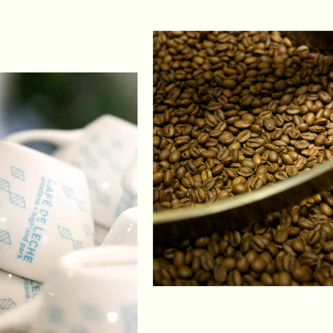
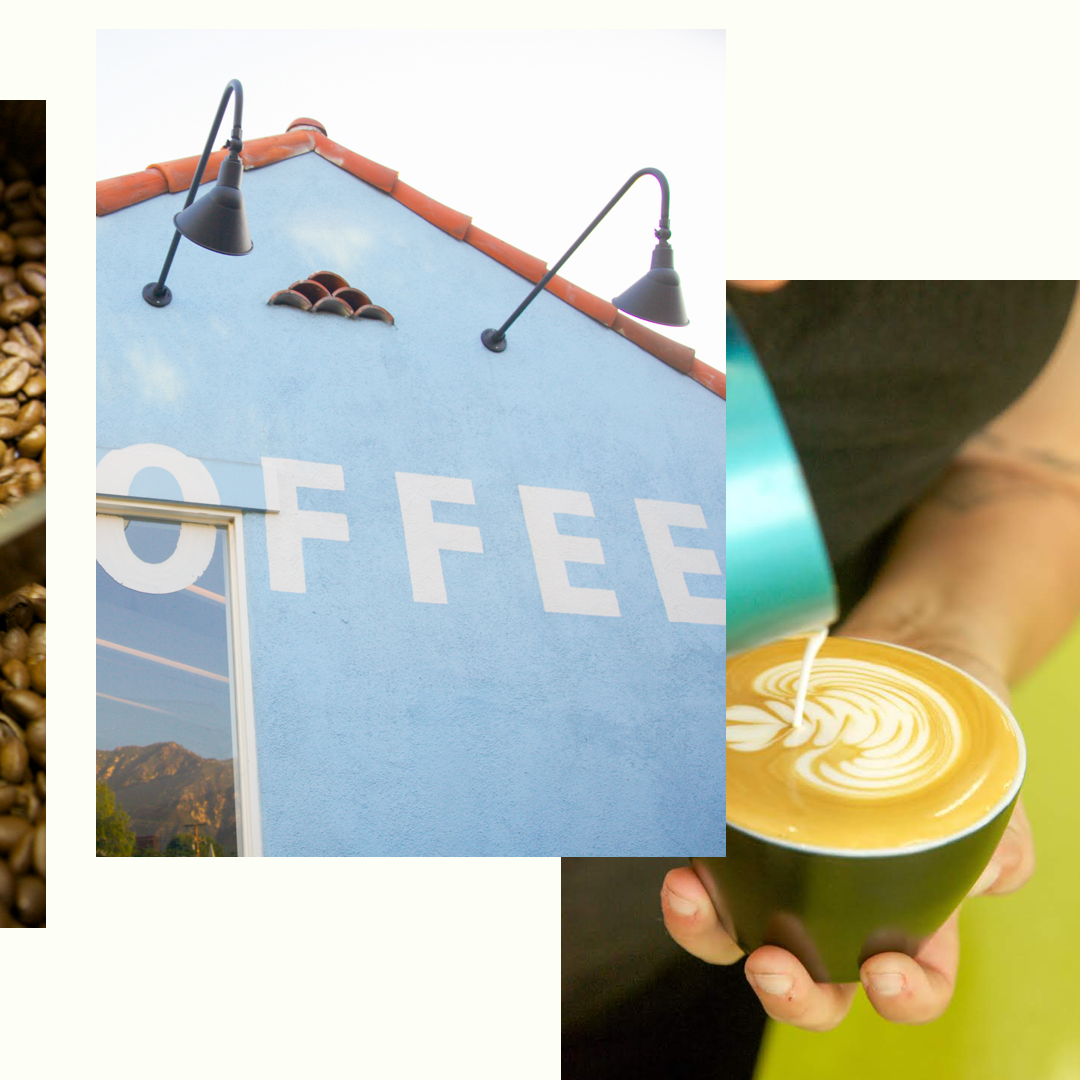
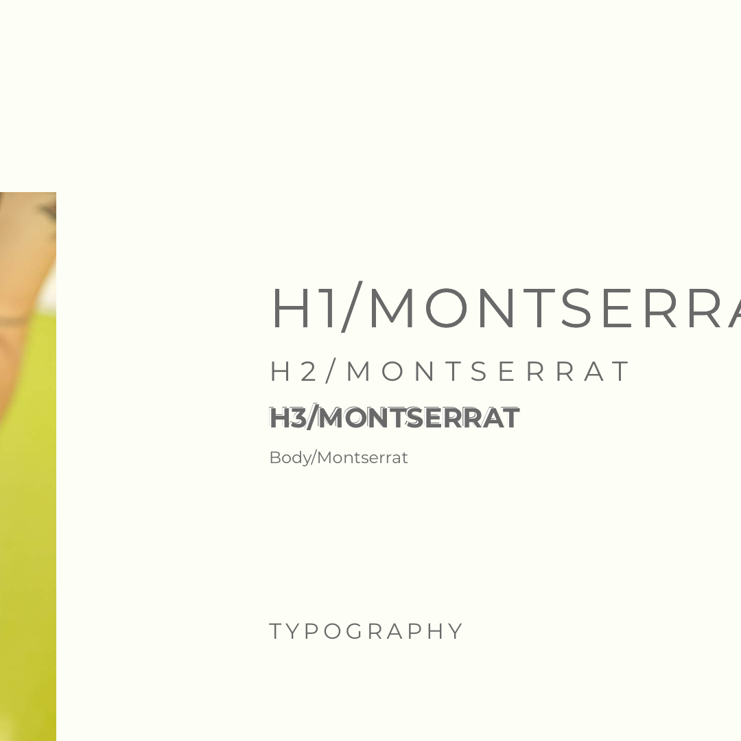
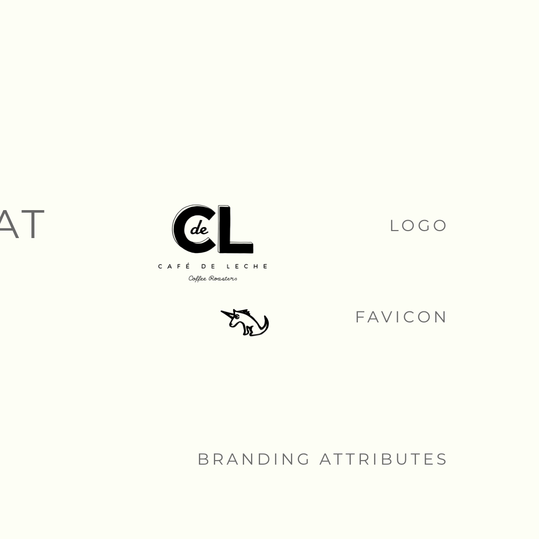
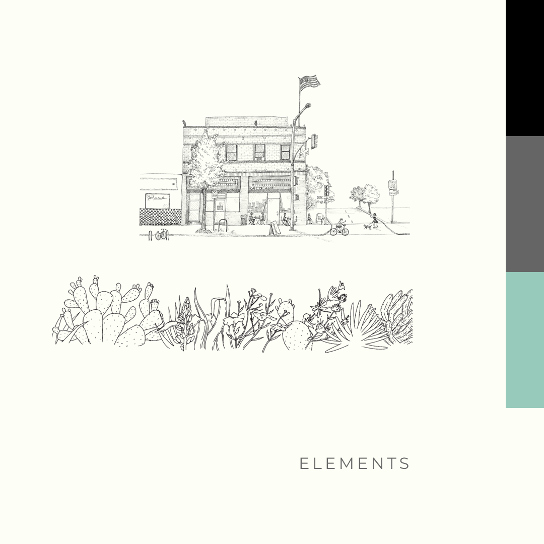
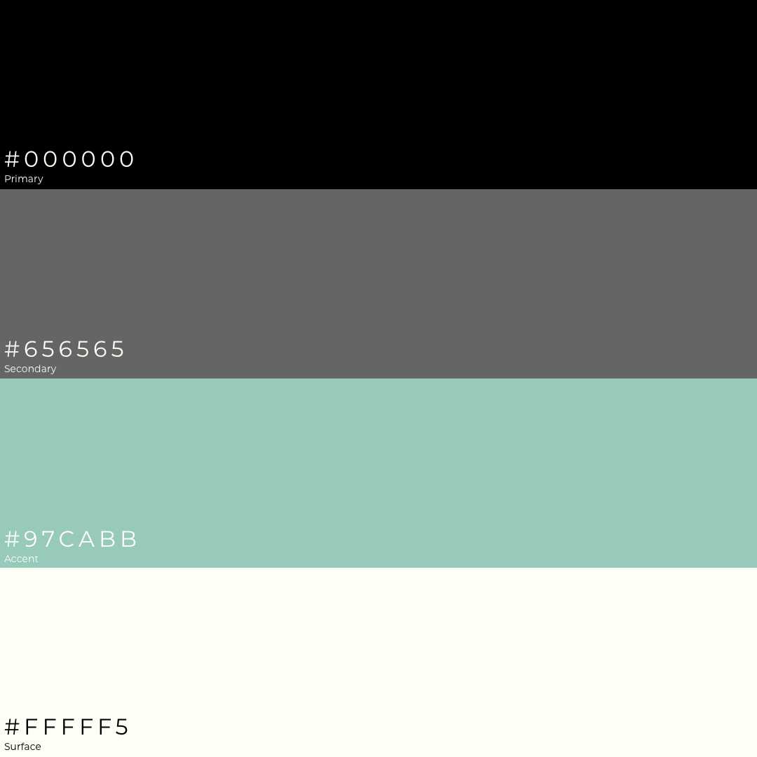
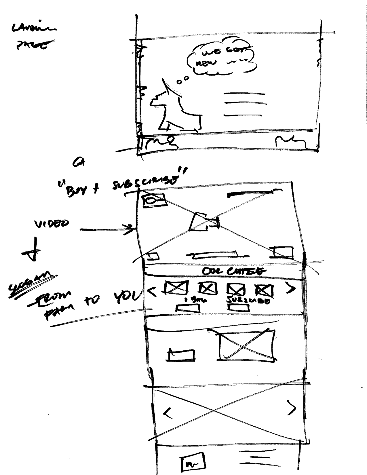
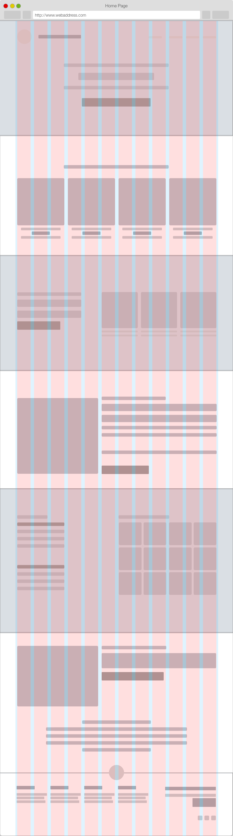
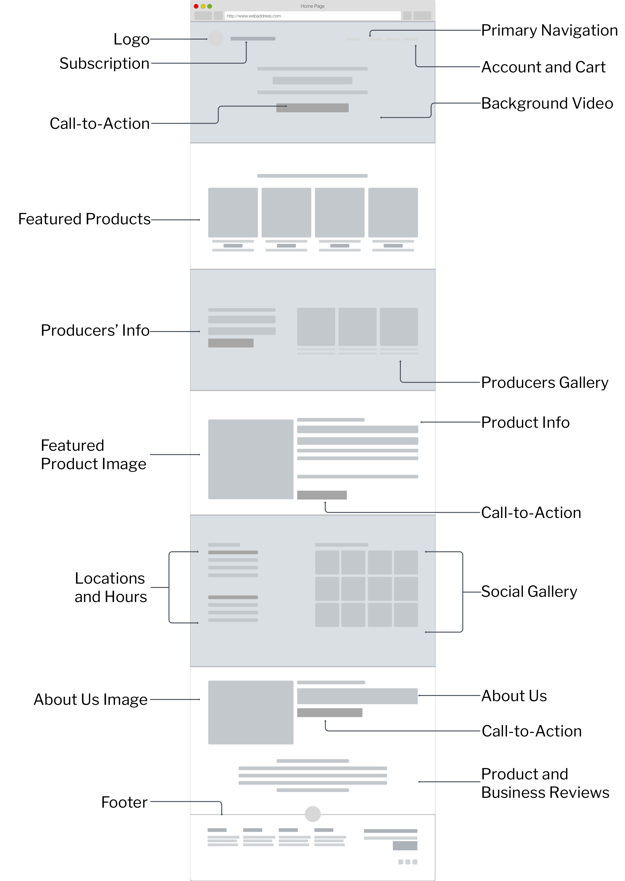
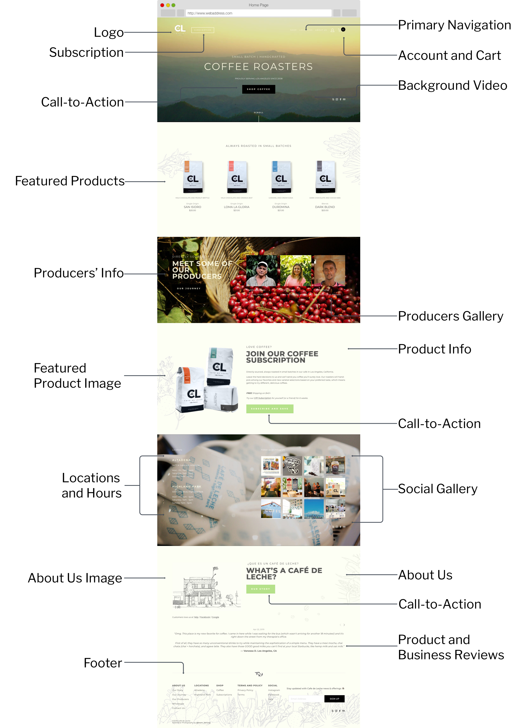
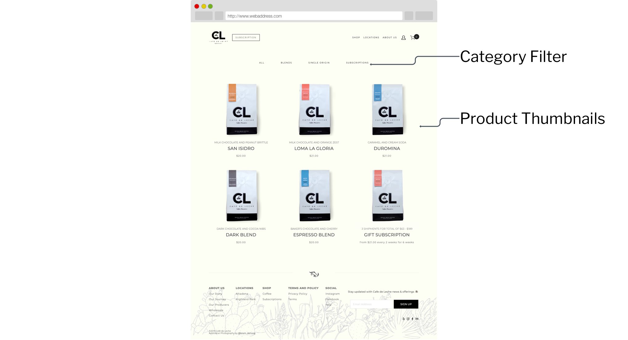
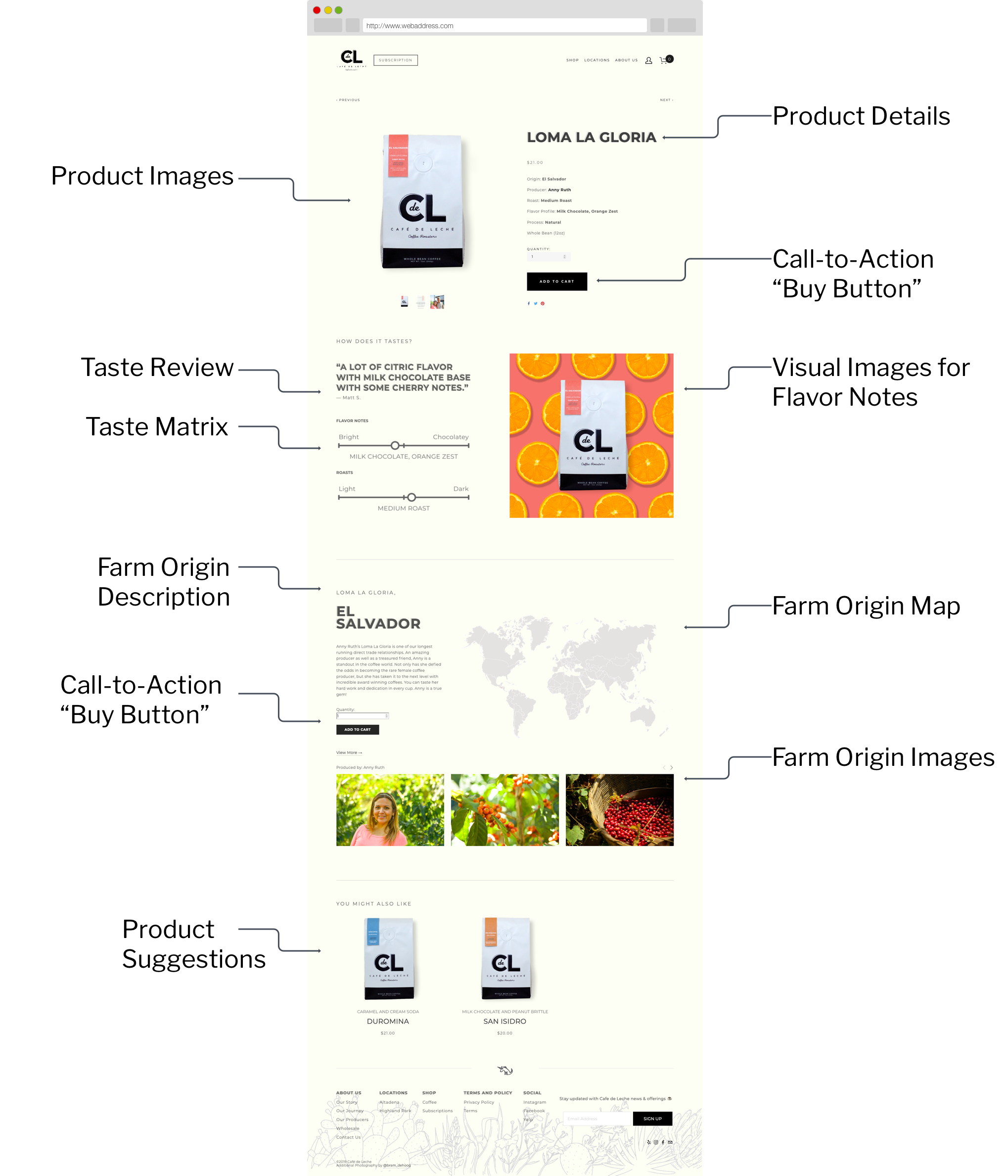
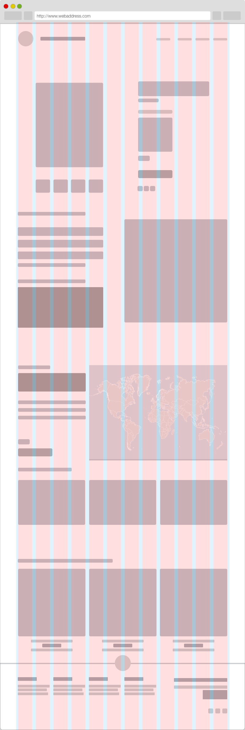
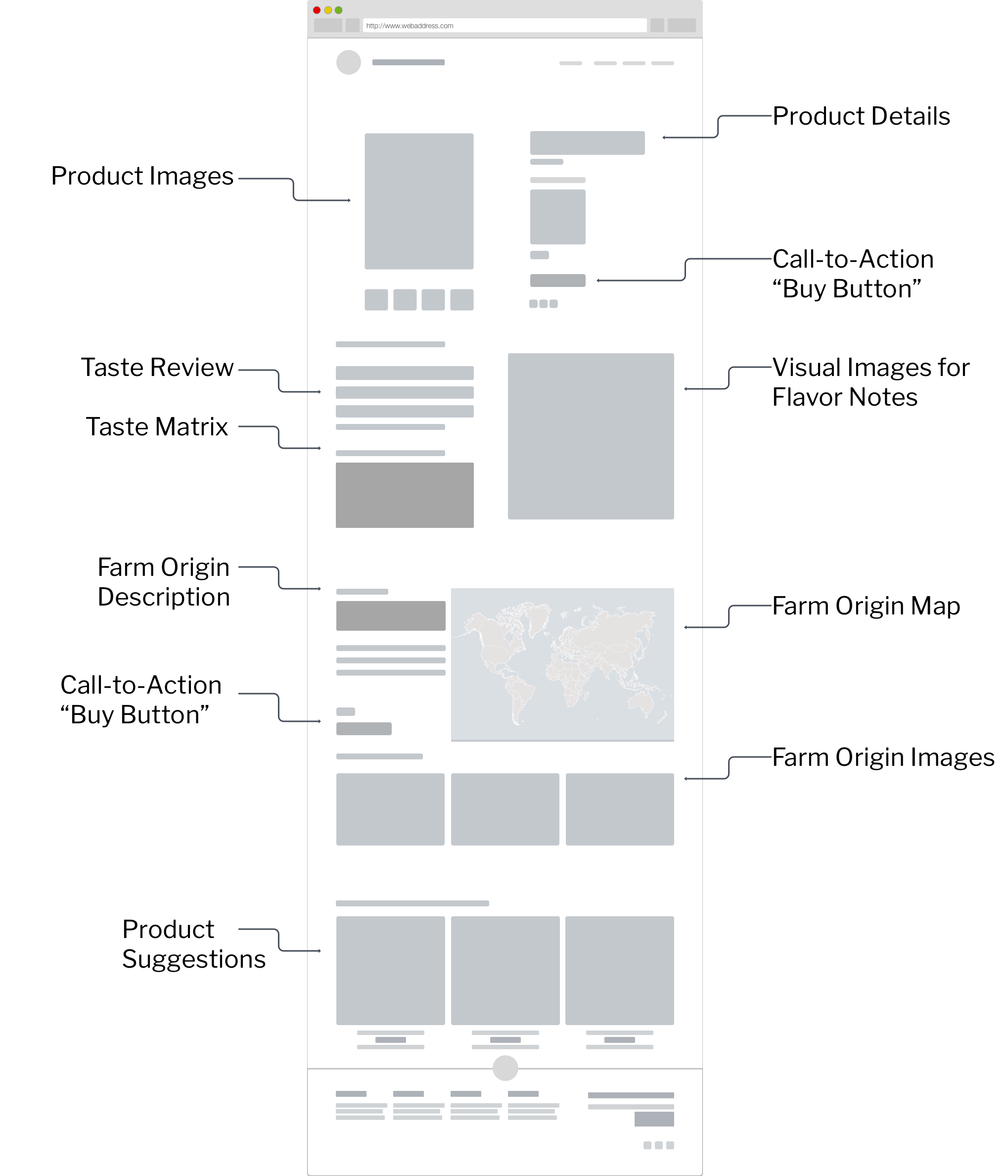
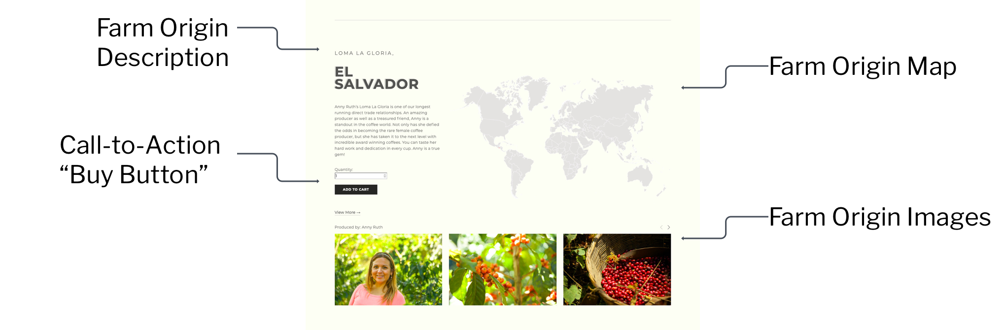
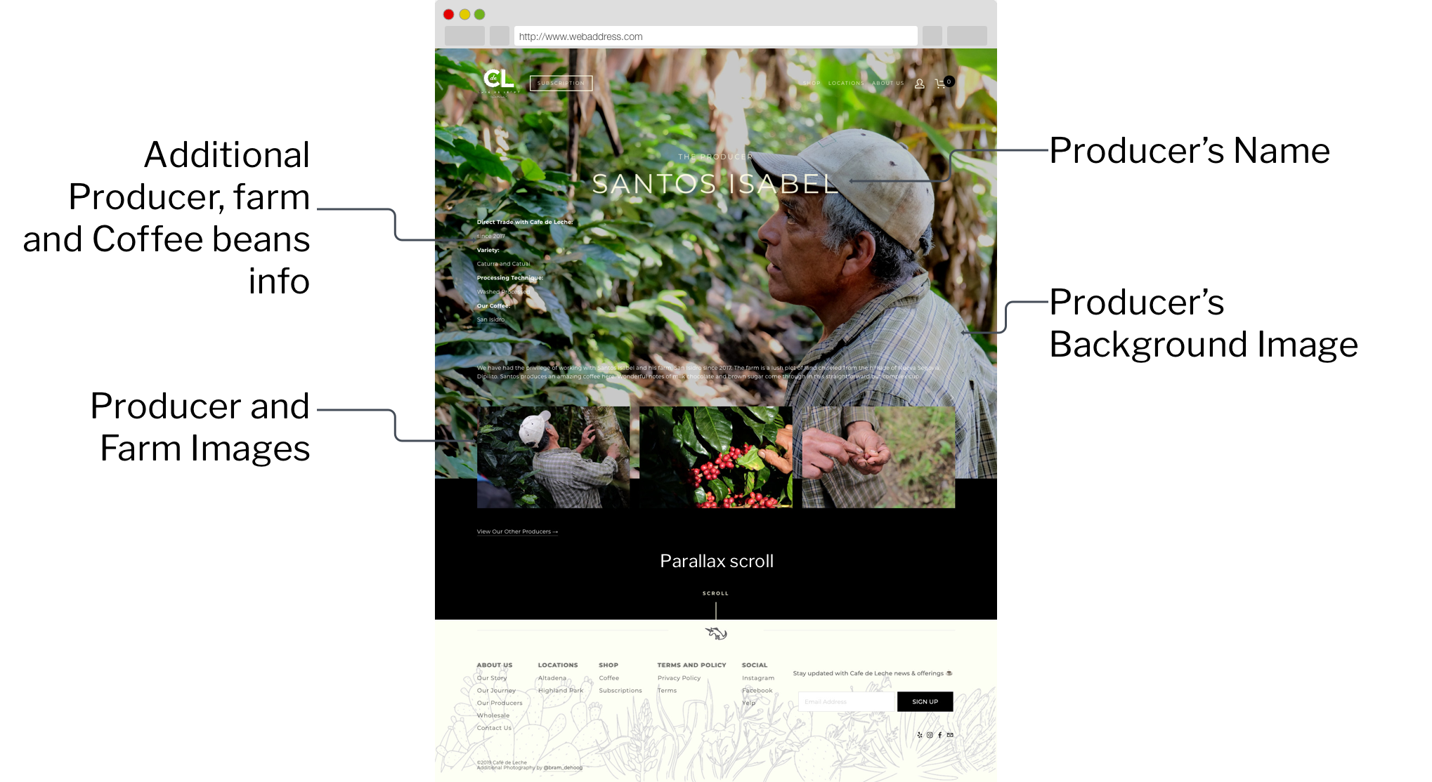
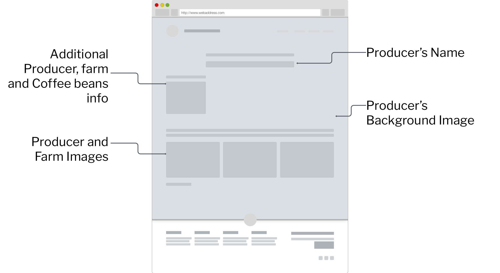
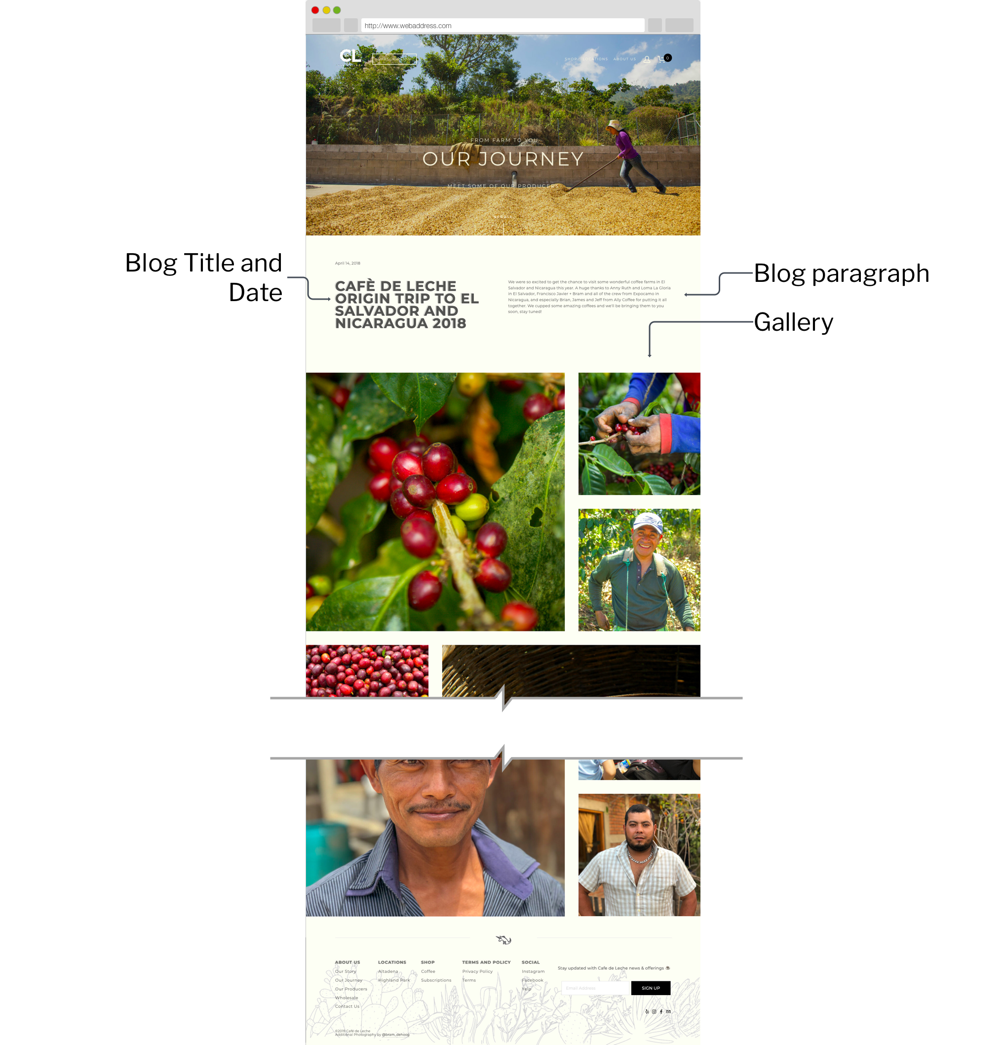
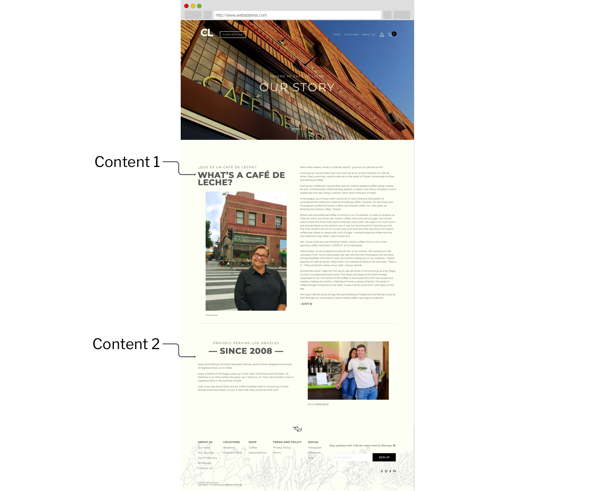
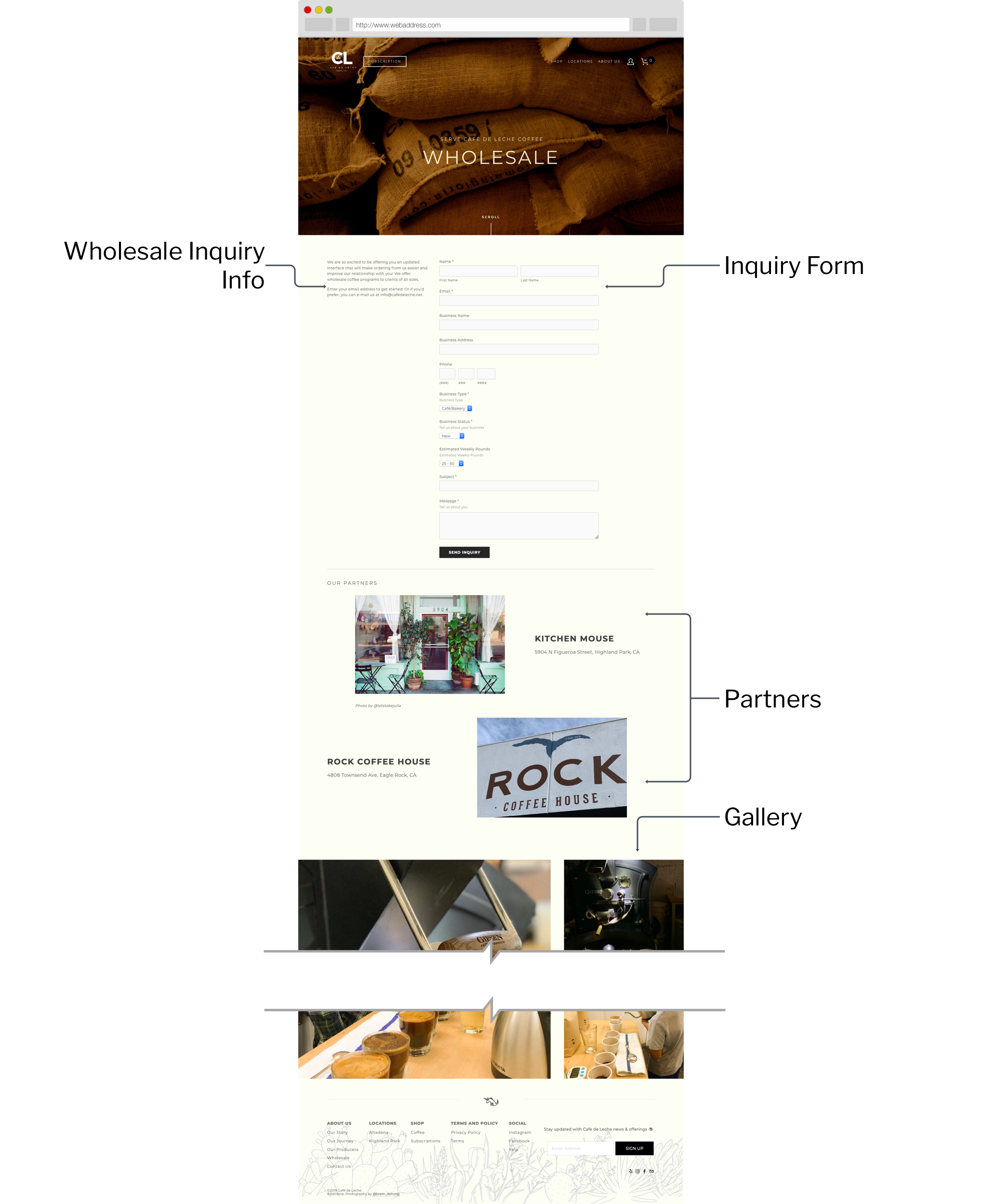
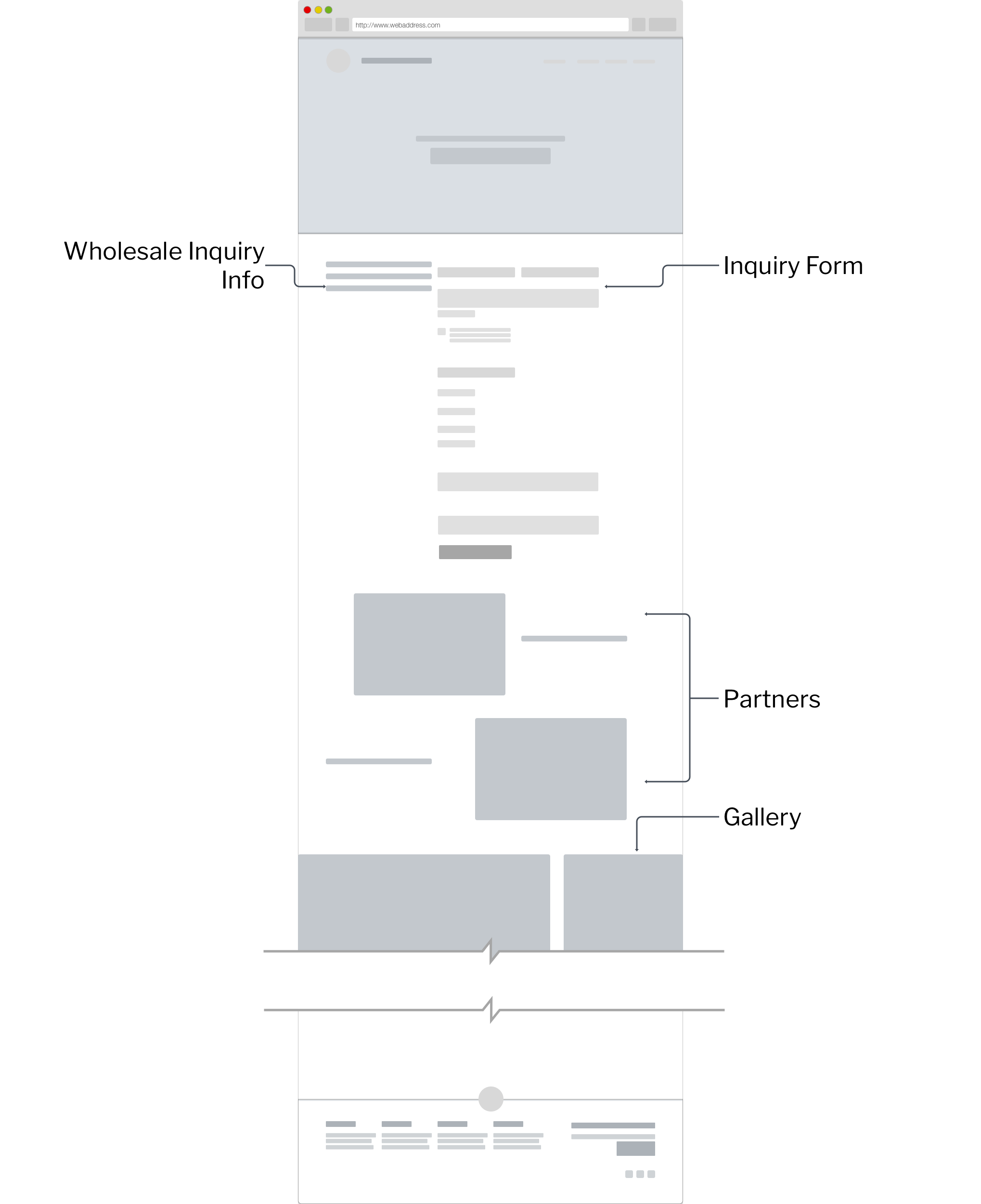
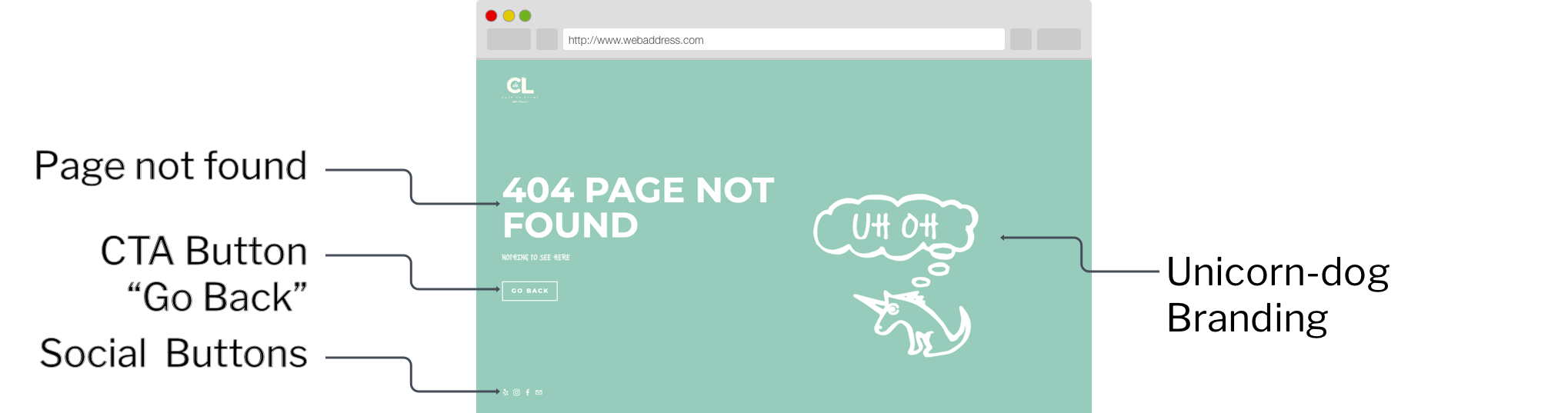
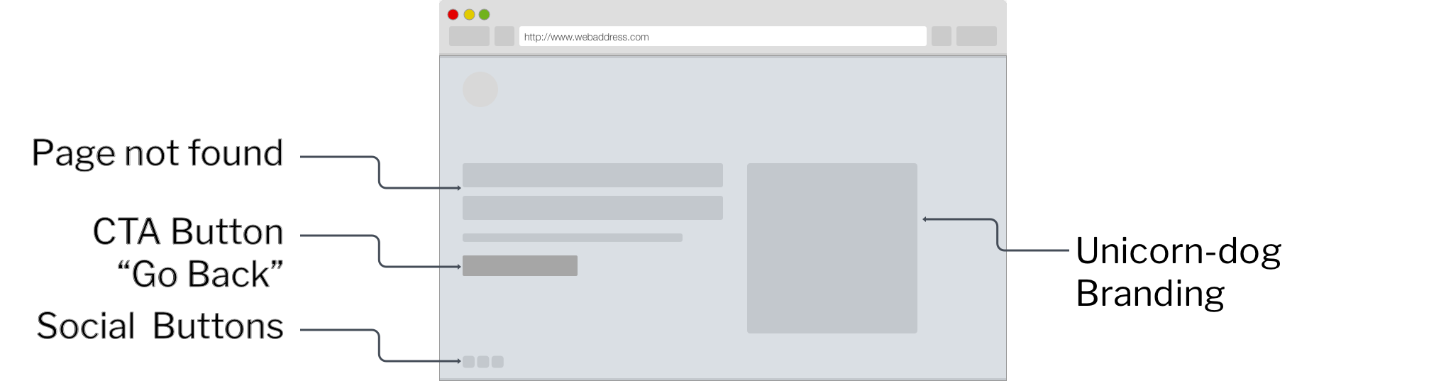
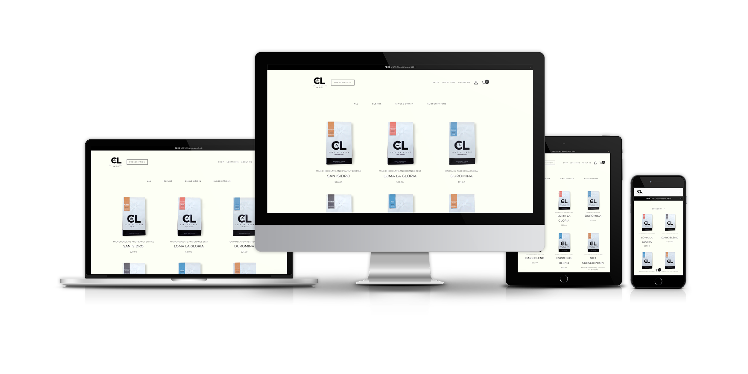
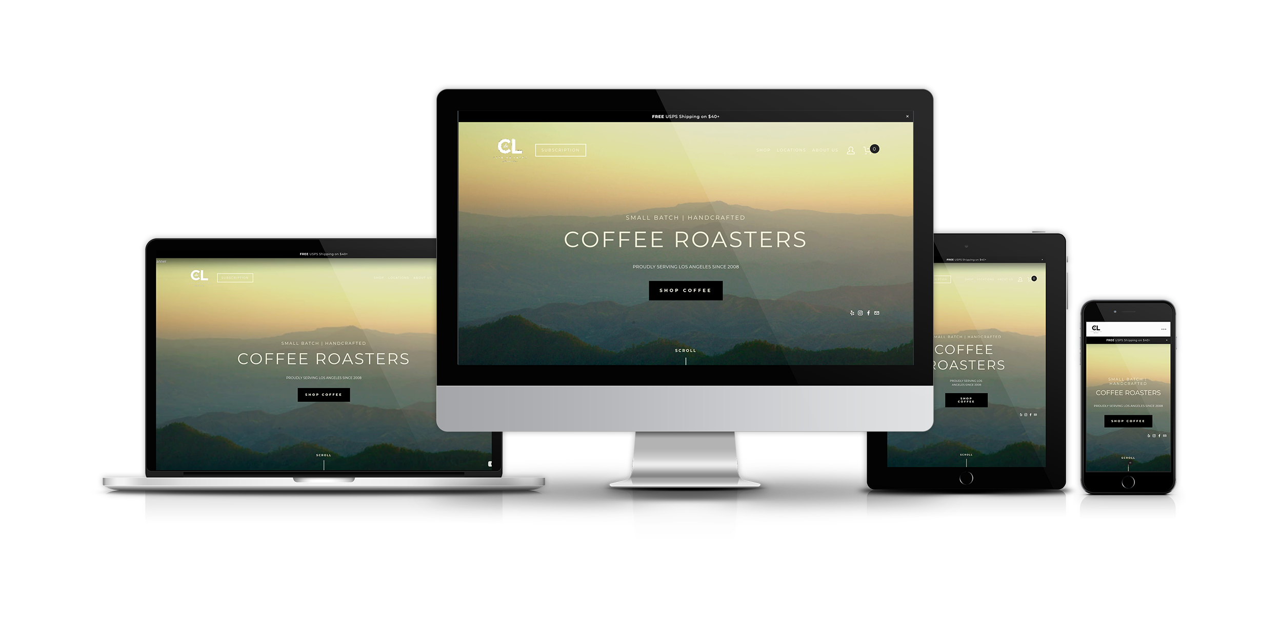
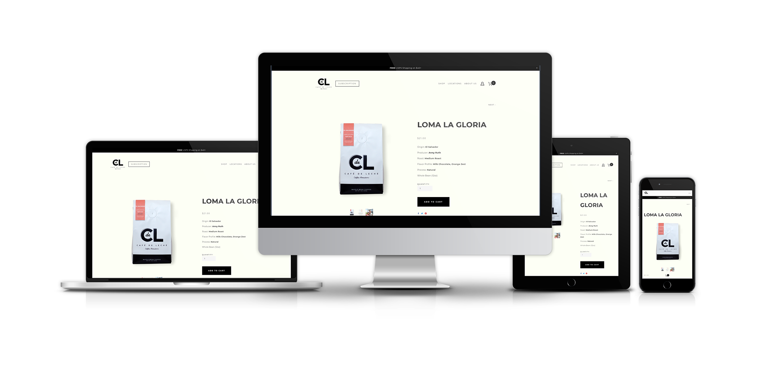
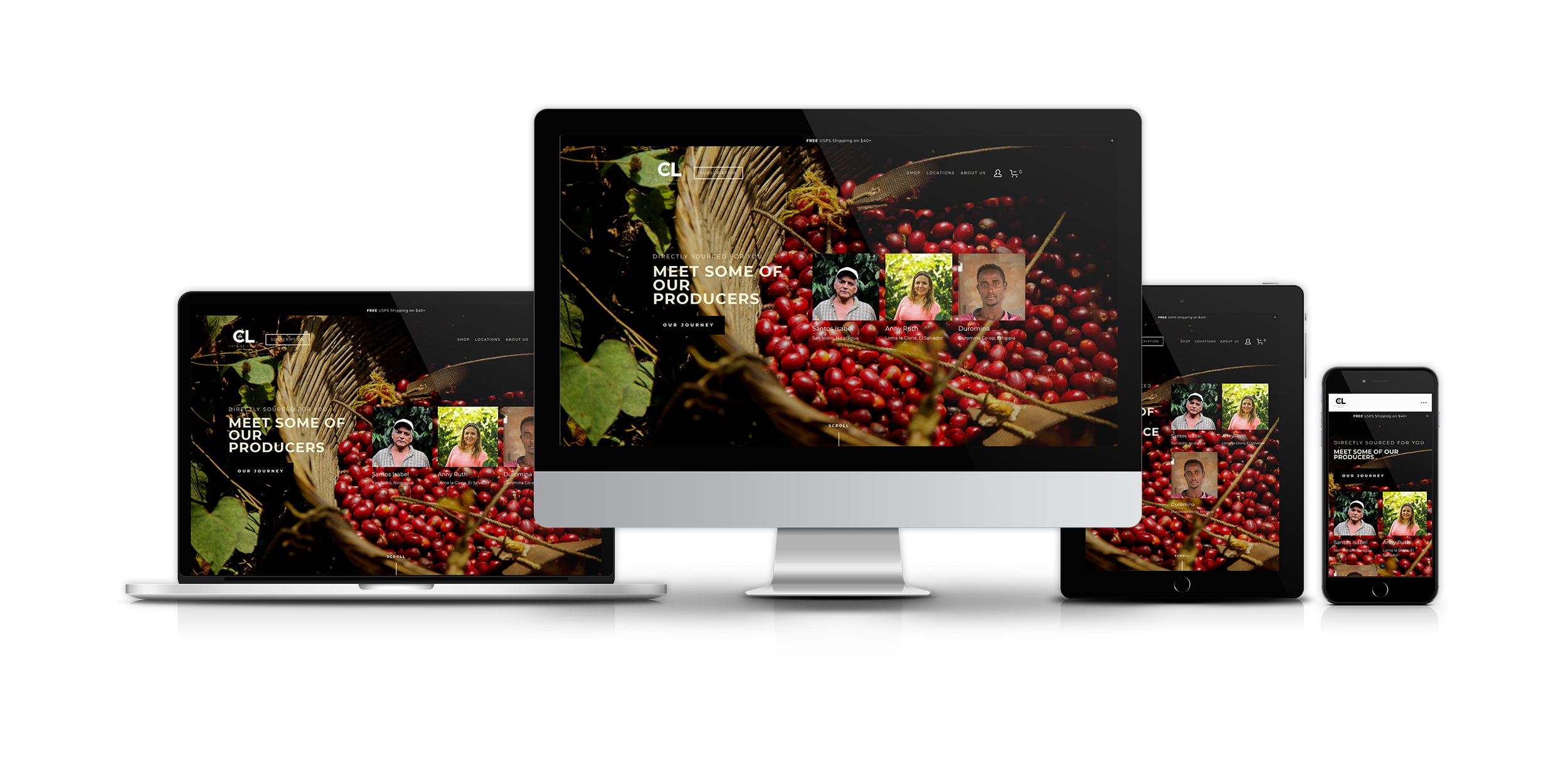
As a web designer, I created a style guide to implement the cafe’s branding into the site. Updated the entire website layout based on the client’s objectives and to cater to the two personas using the collected data in research.

Timeline:

Discovery—2 weeks

Ideation, Design and Iterations— 3 months

Product Development and Usability Testing

Tools:

Pen and paper, posts-it, Baymard.com, Draw.io, Sketch, Adobe Illustrator, Adobe Photoshop, Squarespace

Deliverables:

Contextual Inquiry, Heuristic Evaluation, Competitive Research Analysis, Persona, Card Sorting, User Journey Map, Usability Testing, High-Fidelity Wireframes.

THE ask

I want the ability to sell coffee and coffee subscriptions online with a website, but also through Instagram.

The website should feature our coffee for sale, how to contact us to inquire a wholesale account, tell our traveling origin—our own origin story, and sell some merch.
— Matt Schodorf, Founder, Owner
 

DEFINE


FEATURE PRIORITIZATION

CARD SORTING

Stakeholders picked five major features for the redesigned site, prioritizing each feature via card sorting:

  1. Online coffee store

  2. Subscription

  3. About Us

  4. Wholesale

  5. Merchandising and etc.

Unsurprisingly, the most viable product for the site is the online coffee store. Thereby focusing the entire site on the online coffee buying experience.

Due to the seasonal nature of coffee and to lessen the cost, the stakeholder and I decided to sell only 5 products—keeping the inventory to a viable minimum. The inventory will start with 3 single origins, 2 blends and the subscription service. Merchandises like mugs and tote bags are to be sold next quarter, as well as the seasonal coffee depending on the initial sales and availability.


FEATURE PRIORITIZATION

DOT-VOTING

I then conducted a dot-voting session to strategize and prioritize which accompanying product information should the coffee have. These information are crucial, especially, to the “coffee snob” when considering a purchase.

I gathered 6 common product information from the 4 website the stakeholders wanted to emulate: gget.com, onyxcoffeelab.com, catandcloud.com and www.vervecoffee.com. Then I asked 5 participants, including the stakeholder (red dot), to pick 3 product information they look for when buying coffee.

  • 4 votes - How it Tastes

  • 3 votes - Price

  • 3 votes - Origin

  • 2 votes - Type of Roasts

  • 2 votes - Weight/Quantity

  • 1 vote - Whole or Ground Beans

Data gathered from the dot-voting session will serve as the site’s hierarchy of information for its coffee. Thus, featuring these info throughout the Product Catalog, Product Pages, Product Thumbnails, and Marketing.

 
IMG_20191022_204434.jpg
 

Behavioral flow

CUSTOMER JOURNEY MAP

Keeping Marjorie and Marlon in mind, I constructed a customer journey map to streamline the customer experience within the site.

The map is divided into four major stages:

  1. Awareness

  2. Consideration

  3. Purchase

  4. Retention and Advocacy

For each stage, I mapped actions which prompt to the next stage and what activities users do within the that stage.

Going back to competitor’s analysis, stakeholder picked features he wants to emulate. These features were placed as opportunities and were sorted under the proper stage.


INFORMATION ARCHITECTURE

SITE MAP

After prioritizing the site features and defining the most viable product, I constructed a site map to organize pages, information, and products.


WEBSITE BRANDING


building a brand

BRAND IDENTITY

In Marty Neumeier’s book, The Brand Gap, he defines branding as a person’s gut feeling about a product, person, service, or organization. In other words, it is not what a company say it is, but what an individual say it is.

Since the previous site did not take into consideration the café’s branding, it’s crucial for the redesigned site to have consistent attributes, typography, and logo throughout.


mood board

PHOTOGRAPHY STYLE

Fortunately, the stakeholder has an abundance of photographs of his directly sourced producers and cafés—these elements acted as mood boards.

With careful consideration, the stakeholder and I curated a number of photos we think fit the café’s photographic narrative—which should be as identifiable and memorable as any other visual component associated with the brand. The photographs should reflect the process and quality of the coffee. These photographs generally have warm color palettes, focused, and intimate.


CREATING A STYLE GUIDE

STYLE GUIDE

By building a style guide, it will provide consistency and recognition throughout the site.

I took into consideration identifiable and memorable components in the café. One of the café’s prominent trademark is their “unicorn-dog” sticker. The sticker gives an approachable and fun vibe into the café, and has been popular since its debut. Due to its popularity, I considered the Unicorn-dog as the “mascot” for the redesigned site. But since stakeholders would rather have a sophisticated look, it is important to use this element subtly.

Since the stakeholders want to target specifically the midwest-America market, he asked to represent the shop’s Southern California heritage through some Southern Californian native shrubbery. These shrubbery will be featured throughout the site, as well as in the newly redesigned coffee bags.

They also want to keep a warm color palette, although I have to be careful between bright images not to clash with the entire composition.


IDEATION AND ITERATIONS


DIGITAL WIREFRAMES

HOMEPAGE

During the stakeholder’s brainstorming session, we collaborated ideas as I sketched out pages using pen and paper. After the session, I moved onto low fidelity digital wireframes to determine information architecture, key features and functionalities.

On my first digital wireframes, I referred to the book, Don't Make Me Think, Revisited: A Common Sense Approach to Web Usability, by Steve Krug for web standards and guidelines. I also took bits and pieces from e-commerce sites featured in Baymard.com’s benchmark of 60 top e-commerce sites ranked by user experience performance.

I started the homepage by stating the value proposition on the hero banner, accompanying it with visual images such as directly trade farms, processing method and cafe locations. The Call-to-Action button (shop coffee) is under the company’s value proposition at the center of the page, intended to grab the customer’s attention and entice them to click.

Navigation

Nav3.png

Footer


ECOMMERCE

PRODUCT CATALOG

Due to only having 5 products plus subscription service, I opted to use a category filter instead of a search tab for a simpler product hunt. The product thumbnails were designed to present import product information to help customers decide quicker and make the purchase easier.

PRODUCT THUMBNAILS

To cater both personas when hunting for products, I provided accompanying information on the product’s thumbnail. Using the data gathered from the dot-voting session, flavor information along with its origin and corresponding prices were featured on the thumbnail.

Earlier iterations had a “Taste Matrix” under the product photo, but later testing suggests “casual coffee drinkers” do not understand the visual aid, while “coffee snobs” do not understand the one dimension relationship between citric and chocolatey. On the next iteration, I implemented a simpler descriptive flavor note with additional information when hovered over.


ECOMMERCE

PRODUCT PAGE

With the two personas in mind, I collaborated with the stakeholder in designing the product page. To help communicate and interpret the coffee’s complex taste for “the coffee snobs”, we incorporated product details, flavor guide, and producer’s information. To educate and guide “the casual drinkers” without using overwhelming coffee lingos, we incorporated simpler descriptive taste reviews with visual representation of the flavor notes.

These elements should guide, inform and entice consumers to buy the right coffee for them—moving from consideration to purchasing the product.

To ensure the Call-to-Action button (buy button) stands out, I included bolder text, a larger button, and black color reserved only for CTA.


FLAVOR GUIDE

During the competitive analysis in brainstorming session, Stakeholders stated they really liked Gget.com’s taste matrix, and counterculture.com’s coffee taster flavor wheel.

Both of these tools are excellent resources to guide consumers to buying their preferred coffee, and should be the inspiration to CDL’s version of flavor guide.

I sketched two CDL’s version of the flavor guide. The first being an X and Y axis graph while the second being a two horizontal bar graph.

These sketches were presented to a casual coffee drinker and a coffee snob. Both liked the two horizontal bar graph over the X and Y axis graph due to its clarity and simplicity. However, the casual drinker was confused about the correlation of “Citric and Chocolatey”.

 
counterculture.com’s coffee taster flavor wheel is not the industry standard, but it is widely used among coffee roasters and tasters across the world.

counterculture.com’s coffee taster flavor wheel is not the industry standard, but it is widely used among coffee roasters and tasters across the world.

To educate and guide “the casual drinkers” without using overwhelming coffee lingos, we incorporated simpler descriptive taste reviews with visual representation of the flavor notes.


Taste Guide.png


PRODUCERS AND farm info for single Origin coffee

A single-origin coffee means that it comes from a single producer, crop, or region in one country. These coffee are particularly popular to educated consumers/coffee snobs due to their traceability. By describing its source (the farm, land, people, climate, cultivar, processing and so on) in as much detail as possible will provide accompanying information for coffee snobs.

I added a second CTA(buy) button to provide consumers the ability to purchase after reading all accompanying information without going back to the top page.


ABOUT US

DIRECT TRADE PRODUCERS PAGE

The stakeholder wants to feature the farmers/producers for the purpose of introducing them to the customers. During the brainstorming session, he showed me photos of farmers and their farms which showed how they lived and how they processed the coffee.

Accompanying the photos with information of producers, their farms, their method and their beans will establish reliability and trust to consumer, especially to the “coffee snob” who wants to technical information when considering a purchase—like the processing method and bean variety.


ABOUT US

ABOUT US AND THE COFFEE BLOG PAGES

Similar to the the producers’ page, the coffee blog page introduces customers to the people, farm, processing method behind the coffee and the cafe’s traveling origins. Meanwhile, the About us page aim to state a clear idea of the cafe’s mission statement, origin, and what to expect. These pages reinforce credibility and value proposition of the product.


LOCATION PAGES

These pages contain location-specific information, such as operation hours, address and contact info. Unlike the other pages, these are made to appeal towards local customers who are considering making a purchase in the café. The 2 location pages have abundance of well-lit photos which serve as a virtual tour.

In addition, Altadena location offers venue rental, so I made a CTA button and form to streamline inquiries and scheduling.


WHOLESALE

In addition to subscription service and online store. Stakeholder also want the ability to acquire partners for a wholesale account. One problem of offering a wholesale account is not knowing who is qualified to have one.

To solve this, I implemented an Inquiry form. The form will help streamline the vetting process to ensure people who wants to partner are legitimate small business owners and/or are worth the discounted rate.

Current partners are also featured under the inquiry form to establish reliability and help sell wholesale.


404 ERROR PAGE

While a 404 page is a page I don’t want users to see, I opted to create the page where I can incorporate the cafe’s branding.

I featured the unicorn-dog as the “mascot” of the site—using it as a delightful and playful image in an unfortunate situation. I also put a CTA button to navigate back to homepage along with social icons.


RESPONSIVE DESIGN

Squarespace's built-in responsive design resizes content and images to fit different devices and screen widths. With responsive design, users can automatically view the site for every potential device, browser, and display width.


SUBSCRIPTION AND USABILITY TESTING


Sundial

Sundial is an easy-to-use scheduling tool for small business owner, operation managers, and employees.

Part 1 | Part 2

Basketball Jones

Basketball Jones aims to create social connections through the sport of basketball

Read More →

The Wallet Project

“The Wallet Project” is the secure wallet: a solution for people who always lose their wallets unattended.

Read More →


Thanks for reading!