CDL_FinalLogo_White.png


Café de Leche is a local coffee shop in Highland Park, Los Angeles, CA. With the coffee business booming, stakeholders are looking to scale via e-commerce.

By redesigning the current website, Café de Leche will serve small batch, handcrafted, roasted coffee from their own local community and worldwide.

BG.png
 

OVERVIEW

With the coffee business booming, Café de Leche owners are looking to scale via e-commerce. Thereby, commissioning me to update the current website.

While Café de Leche already has a website, it is not catered for e-commerce. I collaborated with the stakeholders to strategize design approach for the site. Further user research was also conducted, yielding ideas that caters the user’s needs and the stakeholder’s objectives.


ROLE:

As a UX designer, I introduced UX design thinking to stakeholders. Conducted research to the current website and assess what needed to be removed and updated. Facilitated a brainstorming session with the client to define business objectives, collect information, collaborate and strategize the design process. Using the collected information, we profiled the café’s customers and synthesized personas. I furthered the user research and created user flows to cater the client’s objectives and the site’s primary users—the customers.

As a web designer, I created a style guide to implement the cafe’s branding into the site. Updated the entire website layout based on the client’s objectives and to cater the two personas using the collected data in research.

Timeline:

Discovery—2 weeks

Ideation, Design and Iterations— 3 months

Product Development and Usability Testing—1.5 week

Tools:

Pen and paper, posts-it, Baymard.com, Draw.io, Sketch, Adobe Illustrator, Adobe Photoshop, Squarespace

Deliverables:

Contextual Inquiry, Heuristic Evaluation, Competitive Research Analysis, Persona, Card Sorting, User Journey Map, Usability Testing, High-Fidelity Wireframes.

THE ask

I want the ability to sell coffee and coffee subscriptions online with a website, but also through Instagram.

The website should feature our coffee for sale, how to contact us to inquire a wholesale account, tell our traveling origin—our own origin story, and sell some merch.
— Matt Schodorf, Founder, Owner
 

SUBSCRIPTION SERVICE


DISCOVERY

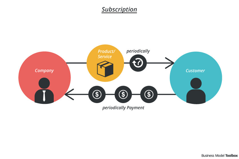
Since stakeholders want to sell coffee throughout the year on a recurring basis, I considered the subscription service as a product of its own. Thus, I did product research on top of the previous research on the cafe’s existing products and branding.

As of 2019, the subscription model continues to grow in popularity. According to a survey by McKinsey & Company, 46% of customers already pay for an online streaming service and 15% have subscribed to an e-commerce service within one year of the survey. Software such as GoPro and Adobe have pivoted to this business model to continue adding value for customers. Other food services companies use a convenience-based subscription model. These companies add value by providing access to niche products like selections catered toward different types of diets.

The subscription model helps capitalize on the compounding value of customer relationships. Recurring revenue models lead to higher revenues and stronger customer relationships. Thus, as long as customers continually see the value Cafe de Leche provides for them, they'll continue to pay for it.

Illustration by https://bmtoolbox.net

COMPETITIVE RESEARCH ANALYSIS

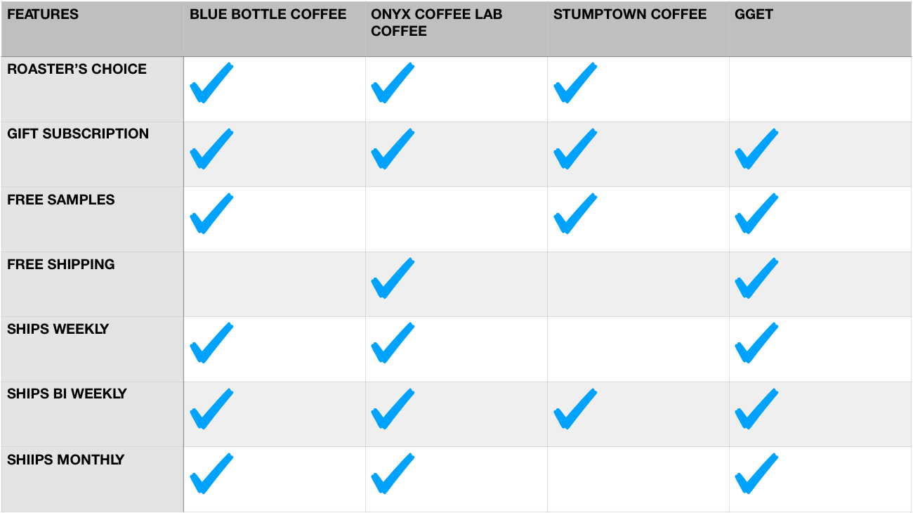
During a stakeholder brainstorming session, Matt and I researched which coffee subscription we liked. We came up with 4 websites that we thought did it best and could model our subscription service.

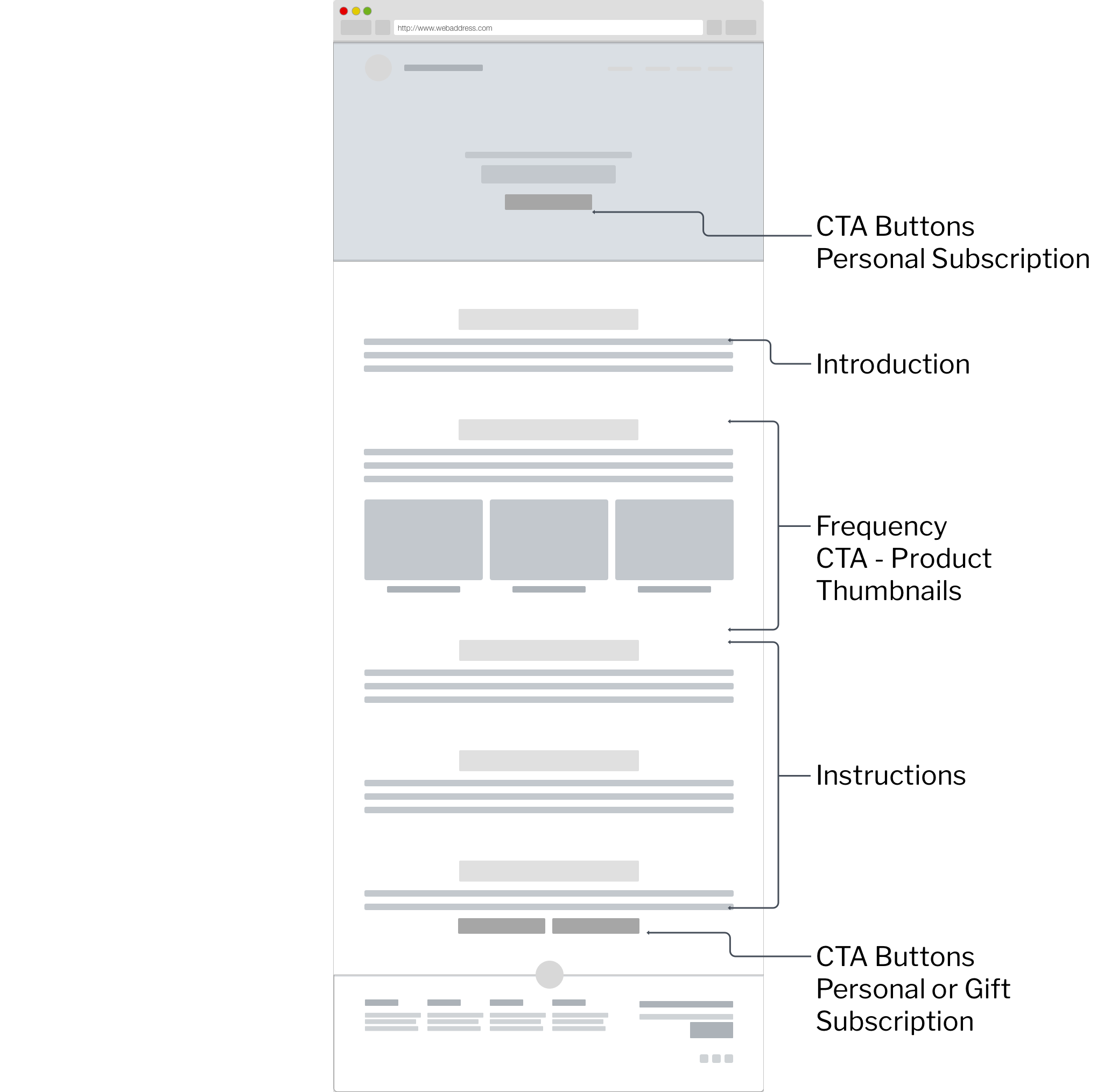
Stumptown coffee ships only bi-weekly, but offers numerous options in bag quantity. The introduction page offers 3 CTA buttons: Subscribe now, Free sample, and Gift subscription. Subscribe now and Free sample buttons are repeatedly shown throughout the entire page, while each step of the customization were broken down per page.

Gget.com has the most intuitive features among the 4 sites. They want to make it as easier as possible for users to buy the subscription service. They do so, by filing out a 3-question survey: how many cups a day, how much you spend and what type of coffee you enjoy. It also offers Free samples with the order summary showing how much they save to show value and get users onboard. Lastly, they have the option of full customization of the plan for more specific users.


Blue Bottle focuses on customization and full control over coffee choices. You can select a half bag, single bag, double bag or even a triple bag and have it delivered every week, two weeks, three weeks, or once a month.

Onyx Coffee Lab’s entire customization process is packed within one page, and has an extensive introduction of their subscription service. You can choose between Gift and Personal subscription, when you want it delivered, the size and quantity of bags, and what type of coffee you want. They offer a variety of blends, but only offer single origins in their Roaster’s Choice.

• 4/4 sites features bi-weekly shipping and Gift Subscription•3/4 sites offers Free Samples, Roaster’s Choice, ships weekly and monthly•2/4 sites offers Free Shipping

• 4/4 sites features bi-weekly shipping and Gift Subscription

•3/4 sites offers Free Samples, Roaster’s Choice, ships weekly and monthly

•2/4 sites offers Free Shipping


DEFINE

feature prioritization

All 4 sites on the competitive analysis, ask 3 fundamental questions in personalizing subscription:

  1. How much coffee?

  2. What type of coffee?

  3. When do you want it?

3 additional questions could also be added:

  1. How long do you want to subscribe?

  2. Ground or Whole beans?

  3. Cost of shipping?

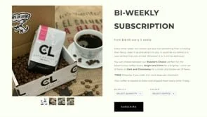
With these questions in mind, the Stakeholder dot-voted which features he wants to offer to the customers when personalizing the subscription. Due to coffee beans waning over the year, he opted to have 3 selections of coffee and based it on the spectrum of flavors. Bright and Citric for a brighter—citric set of flavors, Dark and Chocolatey for a richer and bolder set of flavors, or Roaster’s Choice for all kinds of flavors.

Stakeholder dot-voted features he wants to offer to customers. Due to coffee beans being seasonal, stakeholder opted to have coffee selection by taste—whereas roasters will hand-pick the coffee based on the customer’s preferred taste and availabilit…

Stakeholder dot-voted features he wants to offer to customers. Due to coffee beans being seasonal, stakeholder opted to have coffee selection by taste—whereas roasters will hand-pick the coffee based on the customer’s preferred taste and availability. Stakeholder opted not to offer 5-lbs coffee bags due to shipping cost. Further research regarding this product will be conducted after first quarter of launch.


behavioral flow

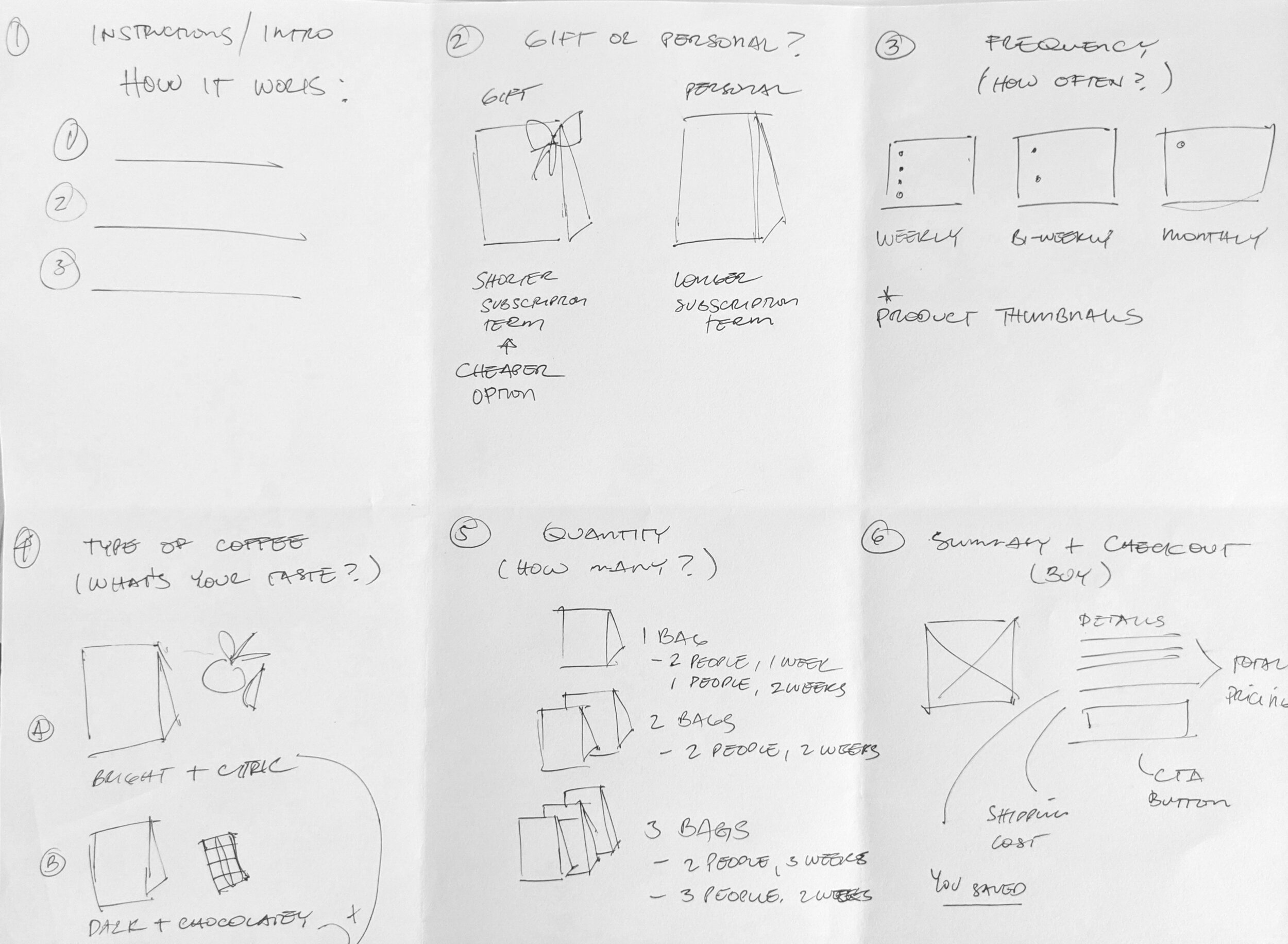
After identifying the product features, we storyboarded how users will personalize and sign up for their subscription.

At this stage, we opted to offer 2 kinds of subscriptions, based on length and who is it for. Gift Subscription for a shorter term subscription and for someone who wants to give a gift. While the Personal Subscription is for those who want full customization and not worry about running out coffee long term.

I then mapped the customer’s journey from product consideration to on-boarding, keeping it to 2 pages when customizing. Introduction, Gift option and Frequency are all in one page. These are the options and guidelines we want to present the users when in the consideration phase. Once the users jump into the product page, they are already in the purchasing phase and the right time to give users varietal selections by flavors and quantity. Standard Shipping info and Order summary are in the checkout page.

Storyboard on how users can personalize their coffee subscription based on their preference and needs.

Storyboard on how users can personalize their coffee subscription based on their preference and needs.


WIREFRAMING

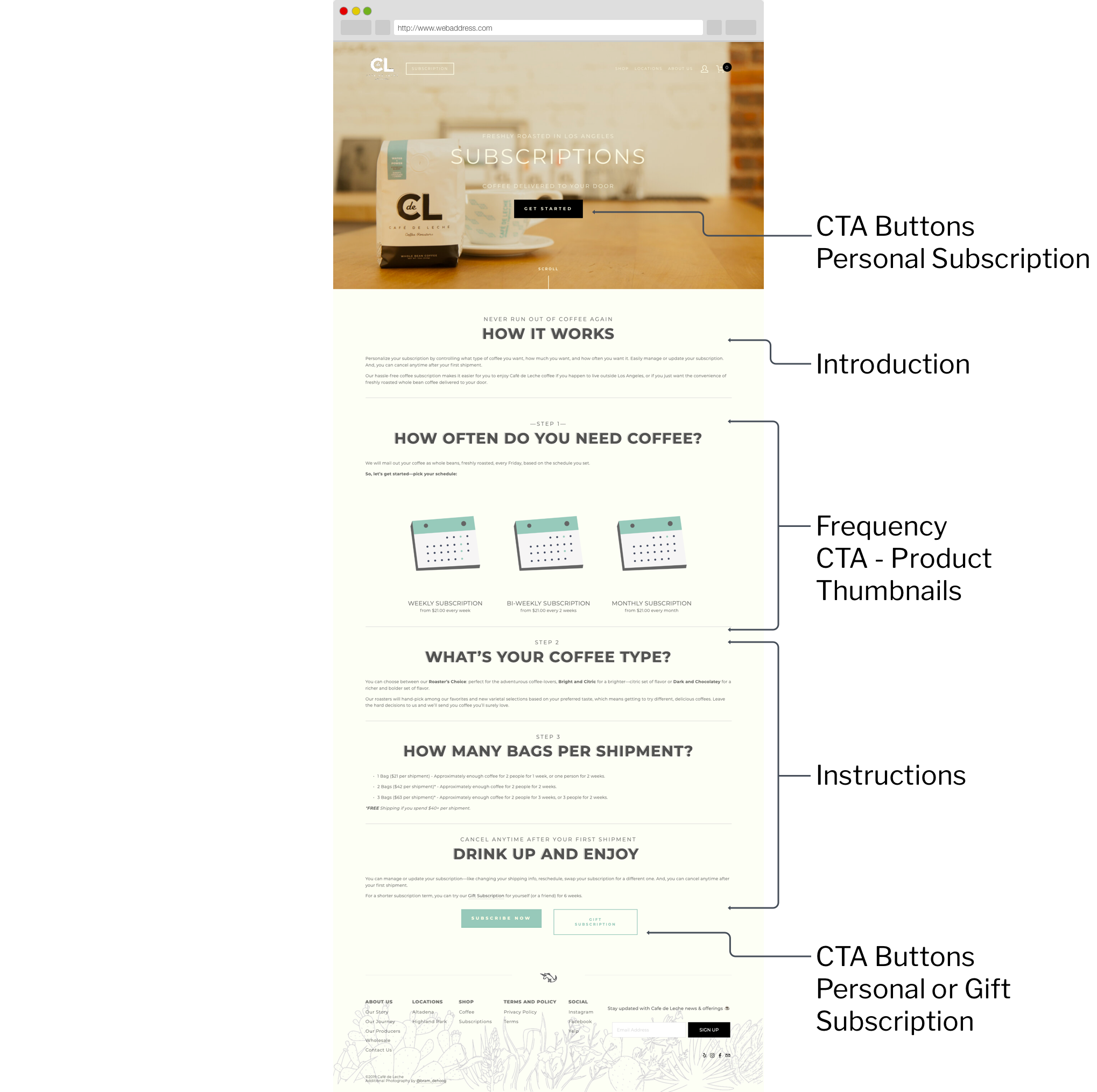
Wireframe flow

I kept the personalization process into 3-4 pages to expedite users into subscribing. The process are broken down to 4 phases, 3 of which are based on the 3 fundamental questions in personalizing coffee subscription:

  1. Step 1—Frequency “When do you want it?”

  2. Step 2—Coffee Type “What type of coffee?”

  3. Step 3—Quantity “How much coffee?”

  4. Step 4—Summary and Checkout

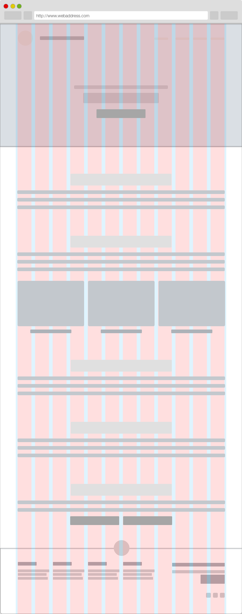
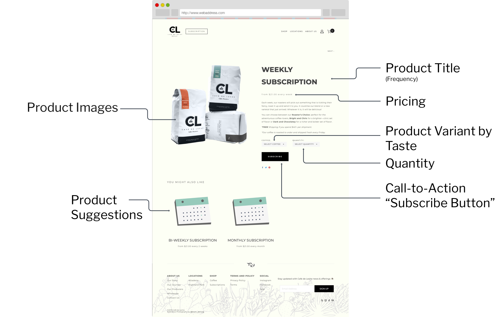
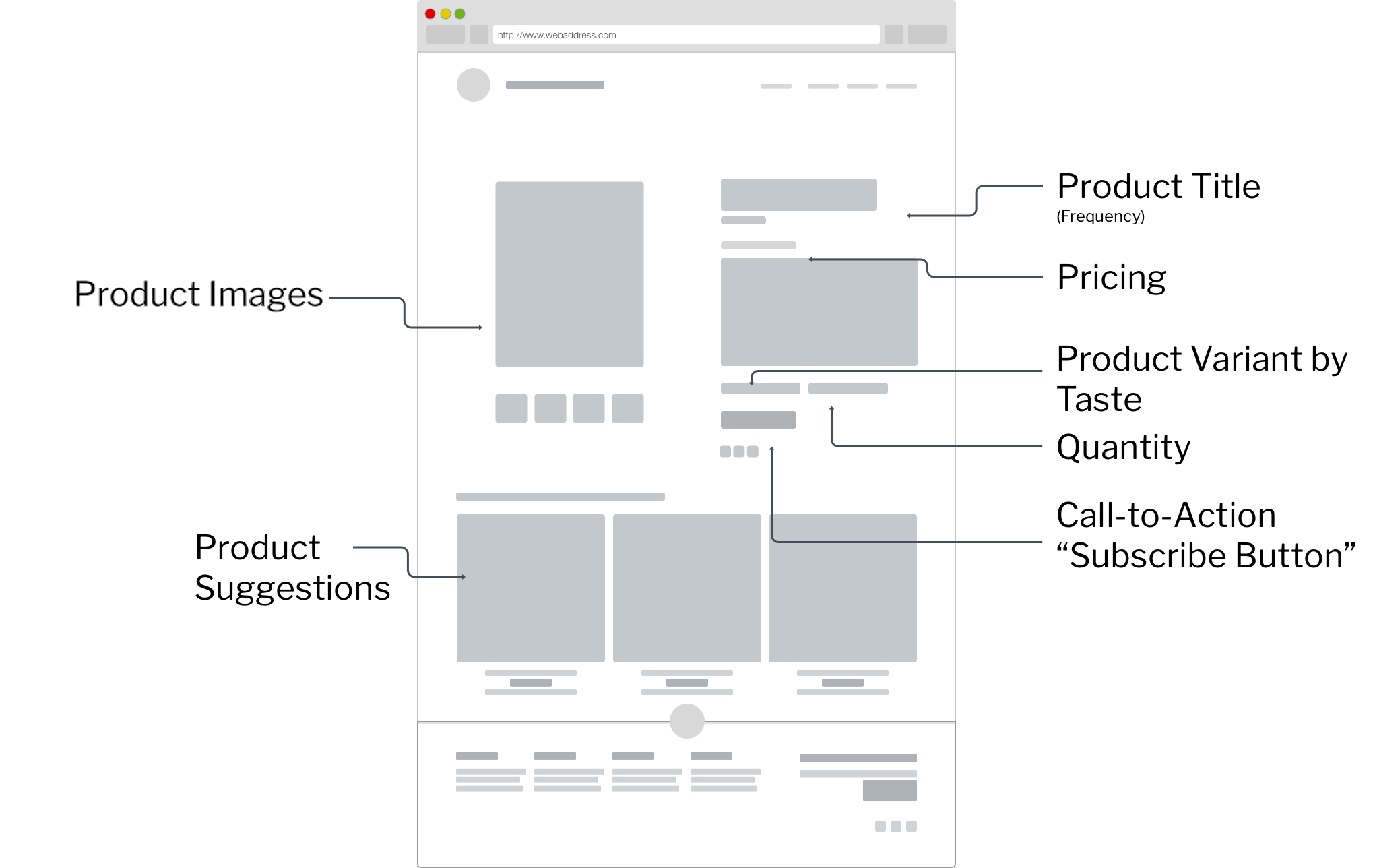
The introduction page has 2 CTA buttons—all directed to Step 1: Frequency. The frequency also acts as the product thumbnail. Thus, clicking it triggers the product page. The next 2 steps (Coffee Type and Quantity) act as product variants, which condense 2 steps into one page.

After clicking the product page’s CTA (subscribe), the cart and checkout page should show clear and concise order summary that includes items purchased, the quantity and price of each item, and the order total. The cart page allows users to edit any items they may want to update or delete, and avoid shipping charge surprises by including a shipping summary.


WIREFRAMES


USABILITY TESTING

E-Commerce and Subscription


USABILITY TESTING SESSION 1

The purpose of the test was to assess whether a sample of the target market can properly use the site's key functions, discover the length of time required for each function, learn the degree of satisfaction users have with your e-commerce site or products, and understand what changes need to be made in order to improve UX, and more specifically, usability.

Two participants are coffee enthusiasts, two participants are casual coffee drinkers, and one participant is random customer in Cafe de Leche. The test have two similar tasks to ensure stable results. Each individual session finished within approximately 10 minutes.

During the session, I explained the test session and asked the participant to read the task scenarios. Their screens are recorded while I take notes on their reactions and comments.

After each task, I asked the participants to rate the interface on a 5-point Likert scale with measures from Strongly Disagree to Strongly Agree.

  • Ease of Use

  • Learnability Information - how easy it would be for most users to learn to use the site

  • Facilitation – how quickly participants could find information

  • Look and Appeal – how quickly participants could find information

  • Find Information - how easy it was to find the information from the screen.

  • Know Your Location - ability to keep track of their location on the screen

  • Predicting What’s Next - accurateness of predicting which section of the application contained the information.

 In addition, I asked the participants the following overall questions:

  • What the participant liked most

  • What the participant liked least

  • Recommendations for improvement


TASK 1

SHOP for COFFEE

Participants are asked to navigate from the homepage to the checkout page by purchasing a product.

Four participants clicked the “Shop Coffee” CTA button except for participant 5 who scrolled and shopped through the featured items.

Participant 1 made the most non-critical errors by duplicating the order, not selecting a bean ground, and asking where the cart is. Participant 4 dragged the “taste matrix” thinking it was an interactive element. All Participants forgot to select a bean ground. No critical errors were made in the testing.

Participants 1, 3, and 4 commented on the product price during the consideration phase, and Participant 5 commented about the product price during adding shipping cost in checkout.


TASK 2

join subscription

Participants are asked to join coffee subscriptions from the homepage to the cart.

All participants clicked the Top left navigation Menu to navigate through the Subscription page. All participants Clicked the “Subscribe” CTA button on the Subscription page.

Surprisingly, participants made no non-critical or critical errors in this task. However, Participant 3 was confused about the difference between the coffee flavors. Task completion time averaged 55.6 seconds. Navigating from Homepage, consideration, and purchase to the cart.


SUMMARY OF DATA

Comments from participants and tables below display summary of the test data.


What the participant liked most:

Aesthetics, Video background, Product Thumbnail, Photographs, Personal anecdotes,

What the participant liked least:

Steep Shipping and Product prices, Coffee lingos, long word content, Tase matrix

Recommendations for improvement:

Simpler visuals, Better info-graphs, emphasis on bean grounds, Include instructions how to order, Delete taste matrix, lower the price

* Satisfaction = Mean combined rating across two post-task measures: Ease of Use, Learnability Information, Facilitation, Look and Appeal, Find Information, Know Your Location, Predicting What’s Next

*No critical errors were made, however, Task 1 averaged 1.6 non-critical error. While there were no non-critical errors in Task 2

*No critical errors were made, however, Task 1 averaged 1.6 non-critical error. While there were no non-critical errors in Task 2

REFLECTIONS

All participants found Cafe de Leche site to be appealing to look at, easy to use, and easy to learn. Although, comments suggest some visuals and word content did not resonate, if not confused the participants. Observational comments also suggest participants were turned off buying a coffee bag for roughly $25 including shipping.

The recommendations below are driven by the participant success rate, behaviors, and comments.

  • The simpler and shorter word content

  • Simplify or remove the taste matrix

  • Lowering the prices or covering the shipping cost of the product

  • Emphasize Bean selections

Adhering to basic usability guidelines and applying these recommendations will drive the conversion rate up for the following quarter.


SITE LAUNCH & WHAT’S NEXT

Since the site relaunched, within the months of January and February, traffic has increased by 670%. However, the initial conversation rate is only 0.53%
— *data provided by Squarespace Analytics

The redesigned site was launched New Years day, January 1, 2020. Upon relaunch, the site visits and engagement increased by at least 6 times compared to the previous year. However, initial conversion rates are low and products were abandoned in the cart during checkout.

I will conduct another test after applying these recommendations. Investigate and test what is the right price-point to convert users into customers.


MARKETING AND ITERATIONS


Up Next

Sundial

Sundial is an easy-to-use scheduling tool for small business owner, operation managers, and employees.

Part 1 | Part 2

Basketball Jones

Basketball Jones aims to create social connections through the sport of basketball

Read More →

The Wallet Project

“The Wallet Project” is the secure wallet: a solution for people who always lose their wallets unattended.

Read More →


Thanks for reading!